-
City Cat Companion
A mobile app designed for City Cat Veterinary Clinic that helps cat owners feel fully prepared for appointments by bringing all essential visit information together in one place. The app eliminates stress and uncertainty from missing or scattered information, making every clinic visit clear, organized, and reassuring.
My Role
Service Designer
Product Designer
Skills
Service Design
Journey Mapping
UI/UX Design
Prototyping
Usability Testing
Team
4 Product Designers (Including me)
Timeline
2 months
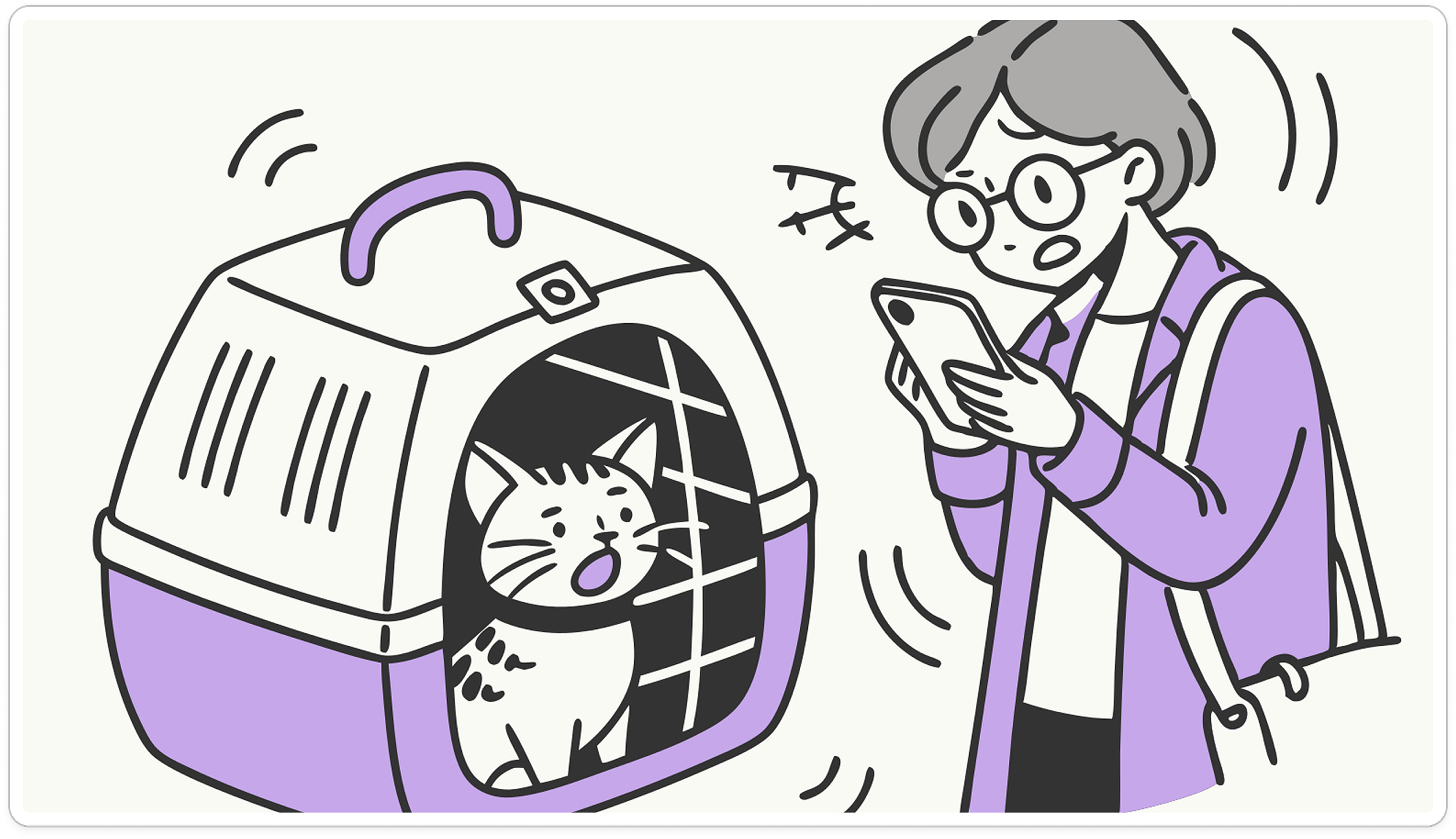
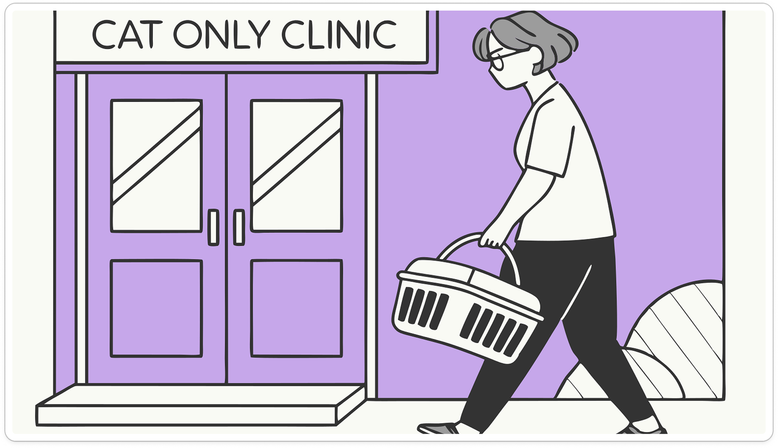
ProblemCat owners often feel anxious and stressed before veterinary visits because they are unsure what to expect and how to prepare in order to ensure the best care for their cats
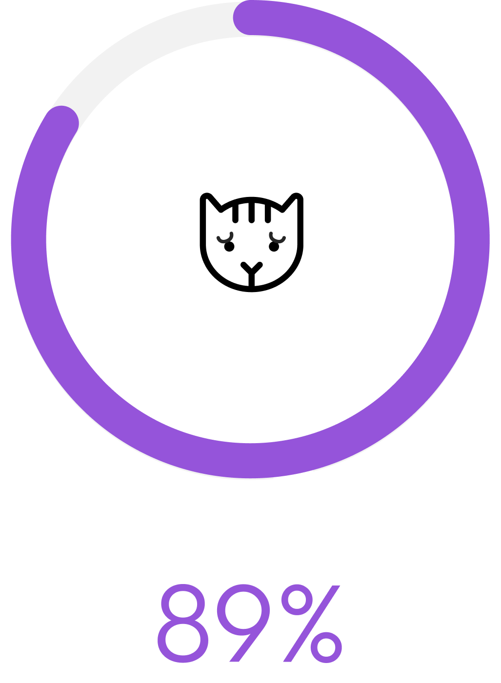
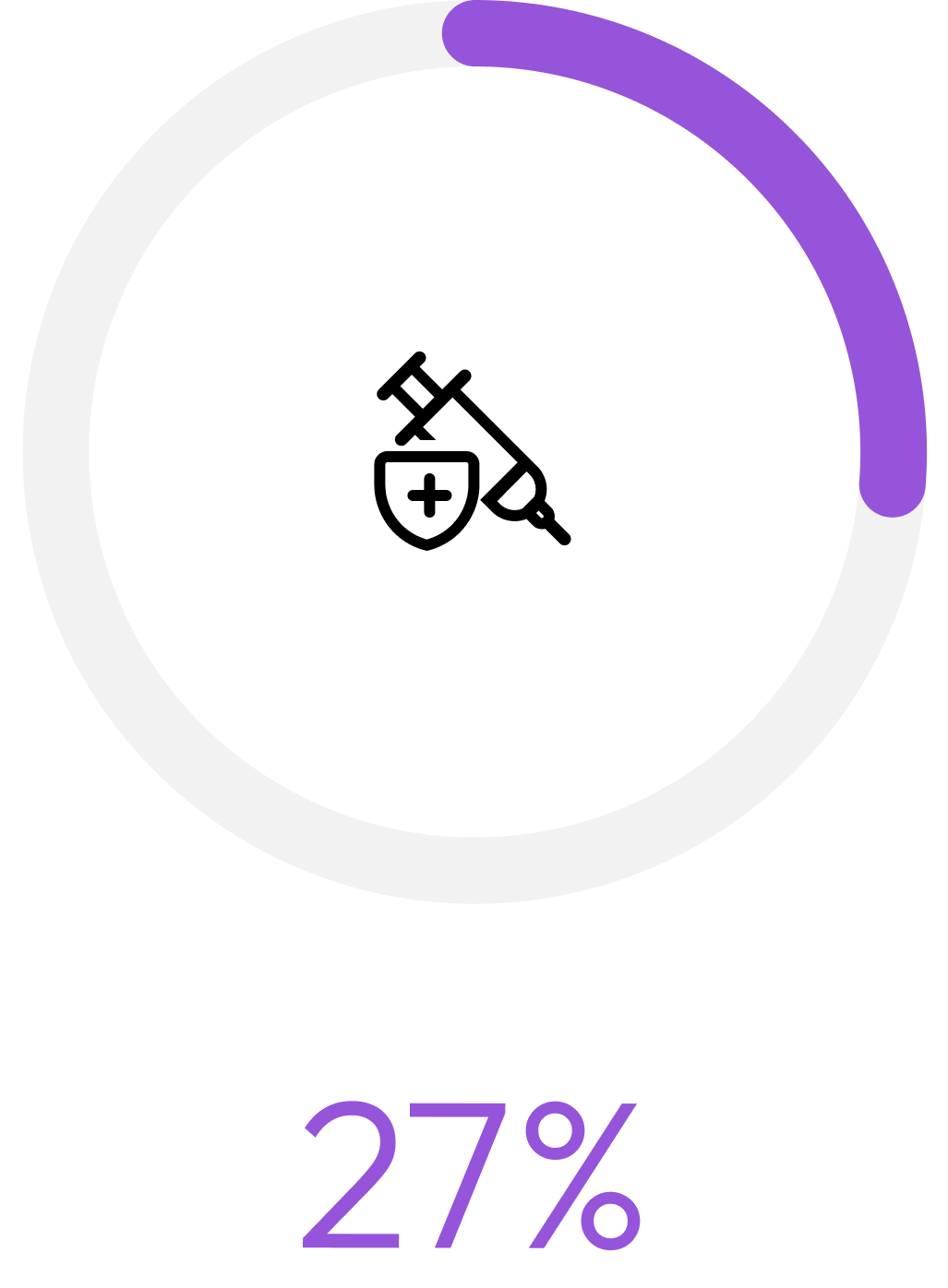
of cats were perceived as stressed during veterinary consultations in a study observing 825 cats. [1]
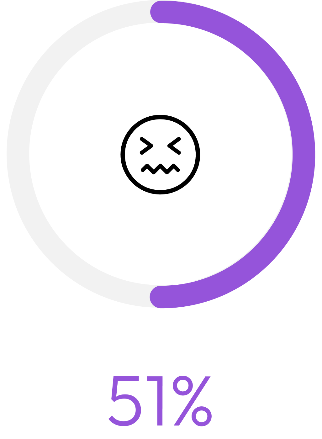
of owners reported feeling stressed themselves in a study observing 819 owners. [1]
of cat owners consider the stress of their cat a significant factor when deciding whether to vaccinate according to Royal Canin Academy. [2]
As part of a graduate-level course, Designing Information Experiences, we partnered with City Cat Veterinary Clinic of Seattle. Our collaboration with the clinic helped us focus on real customer needs and everyday challenges in a genuine clinic setting.
Design ChallengeSolutionKey features
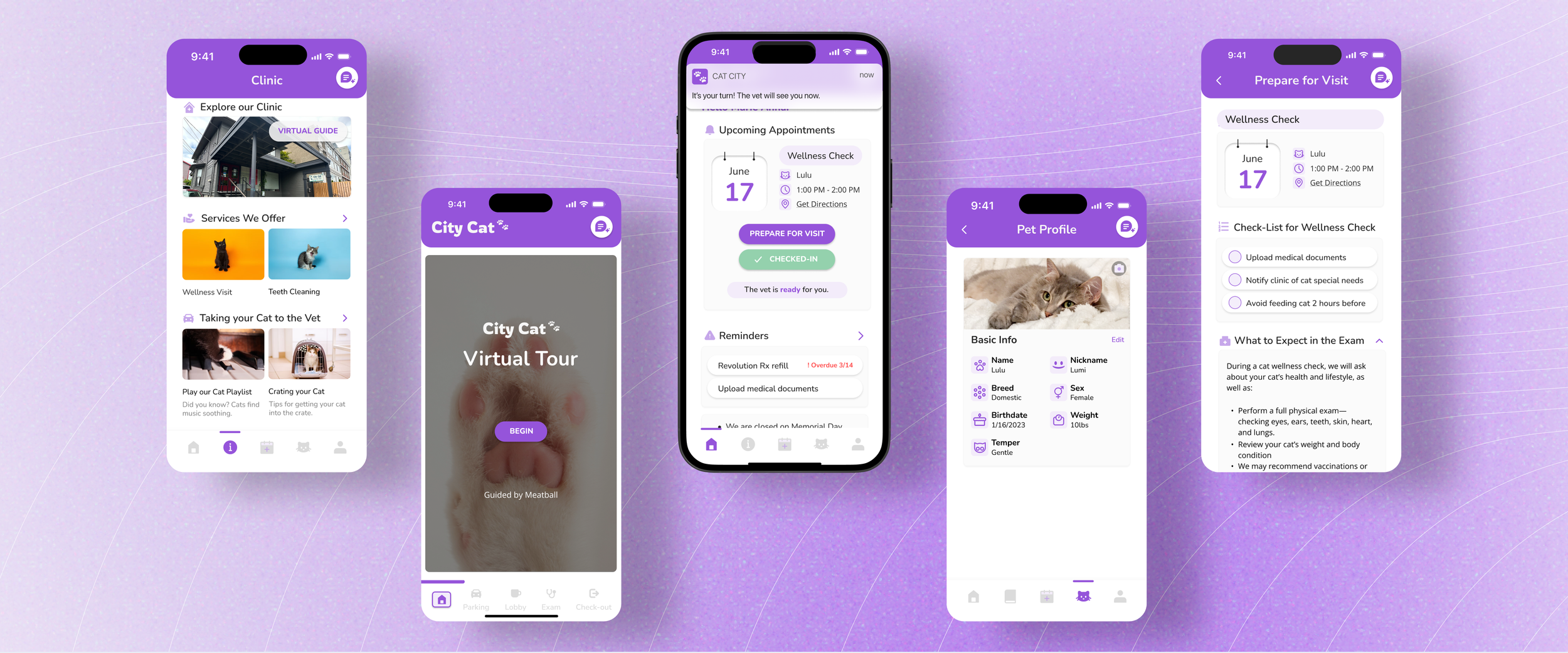
City Cat app puts booking, pet reminders, and exam checklists in one place, giving owners everything they need to feel confident and ready for every visit.
All-in-One Preparation

The app’s gamified tour helps clients explore the clinic, meet staff, and learn how to check in nearby, making new environments more familiar and approachable.
Interactive Virtual Tour
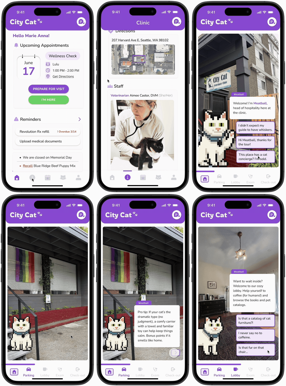
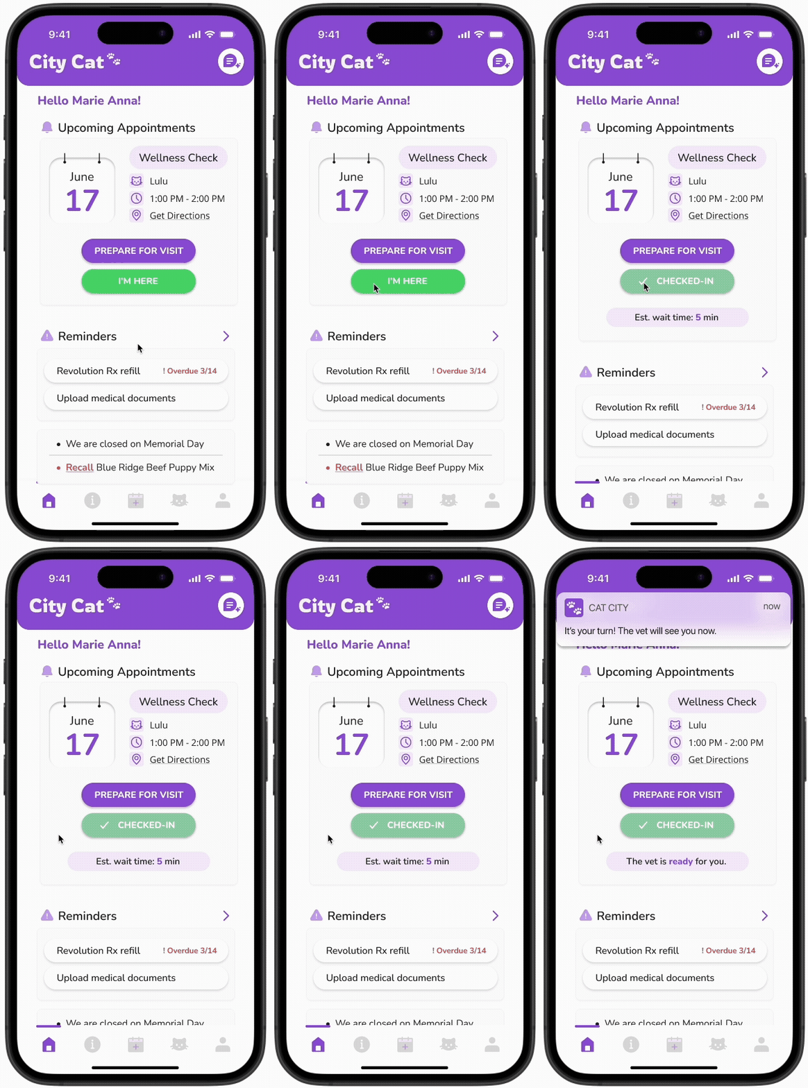
Turn your car into an extension of the waiting room. Clients can check in when nearby and the City Cat app delivers real-time waiting updates and notifications, creating extra space and helping keep clients calm while they wait.
Calm, Connected Waiting
ResearchUncovering gaps in booking, comfort, and privacy at the clinic.
To understand how cat owners experience the clinic and what drives their stress and decision-making, we used several research methods to identify pain points and improvement opportunities. Here’s how we approached our study and what we aimed to learn:
Method 1: generative interviews
3 Health Clinics | Semi-Structured
Uncover service, booking, and communication pain points
General understanding of staff workflows and clinic system gaps
Explore the handling of unpredictability
Method 2: observational studies
City Cat Veterinary | Note Taking
Note wait times as well as client and staff interactions- clinic “flow”
Evaluate space usage and stress points
Observe actual behaviors and emotions of client
KEY FINDINGSThree pain points making City Cat Vet visits harder for cat owners:
1. Inconsistent information delivery
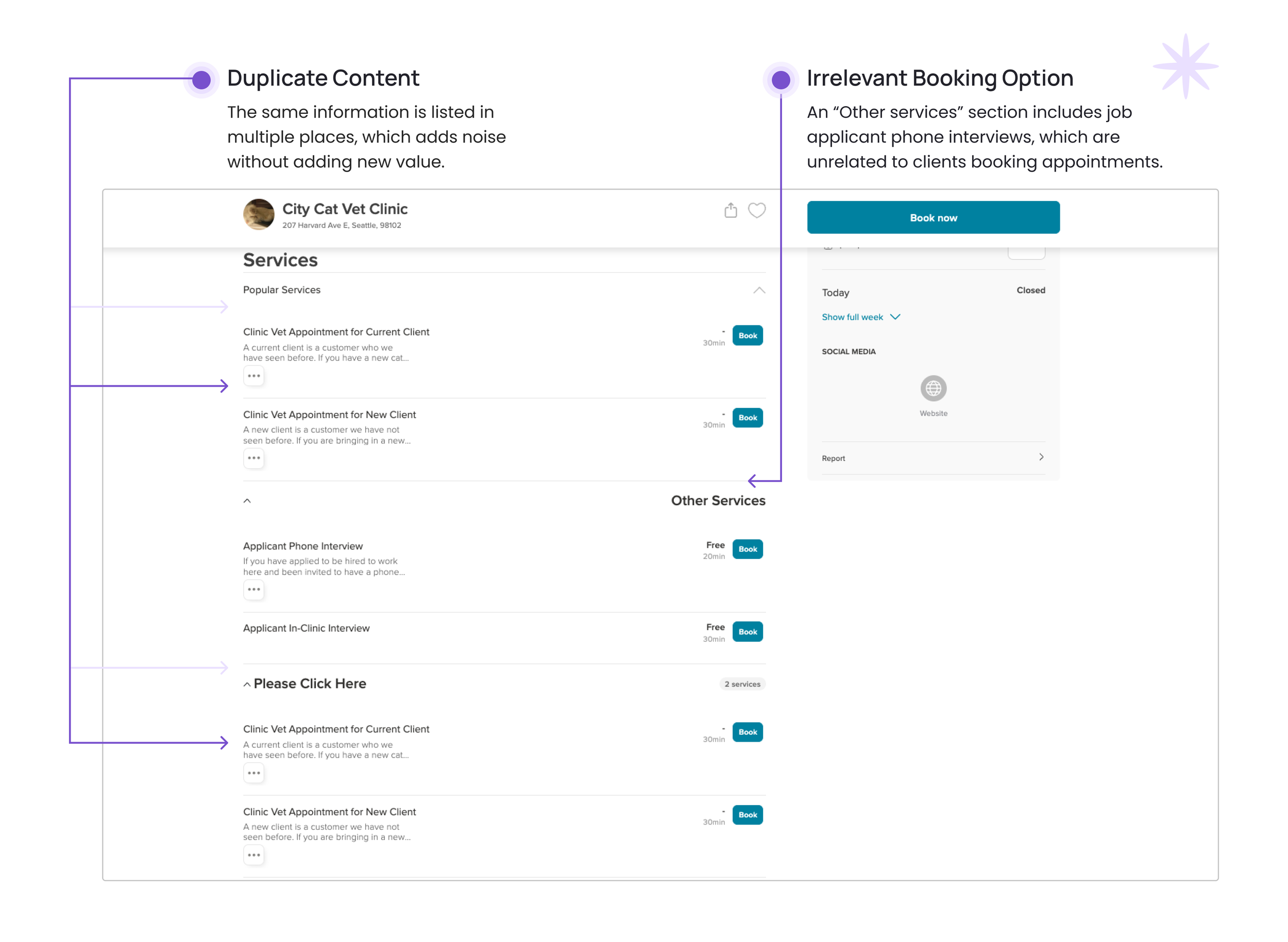
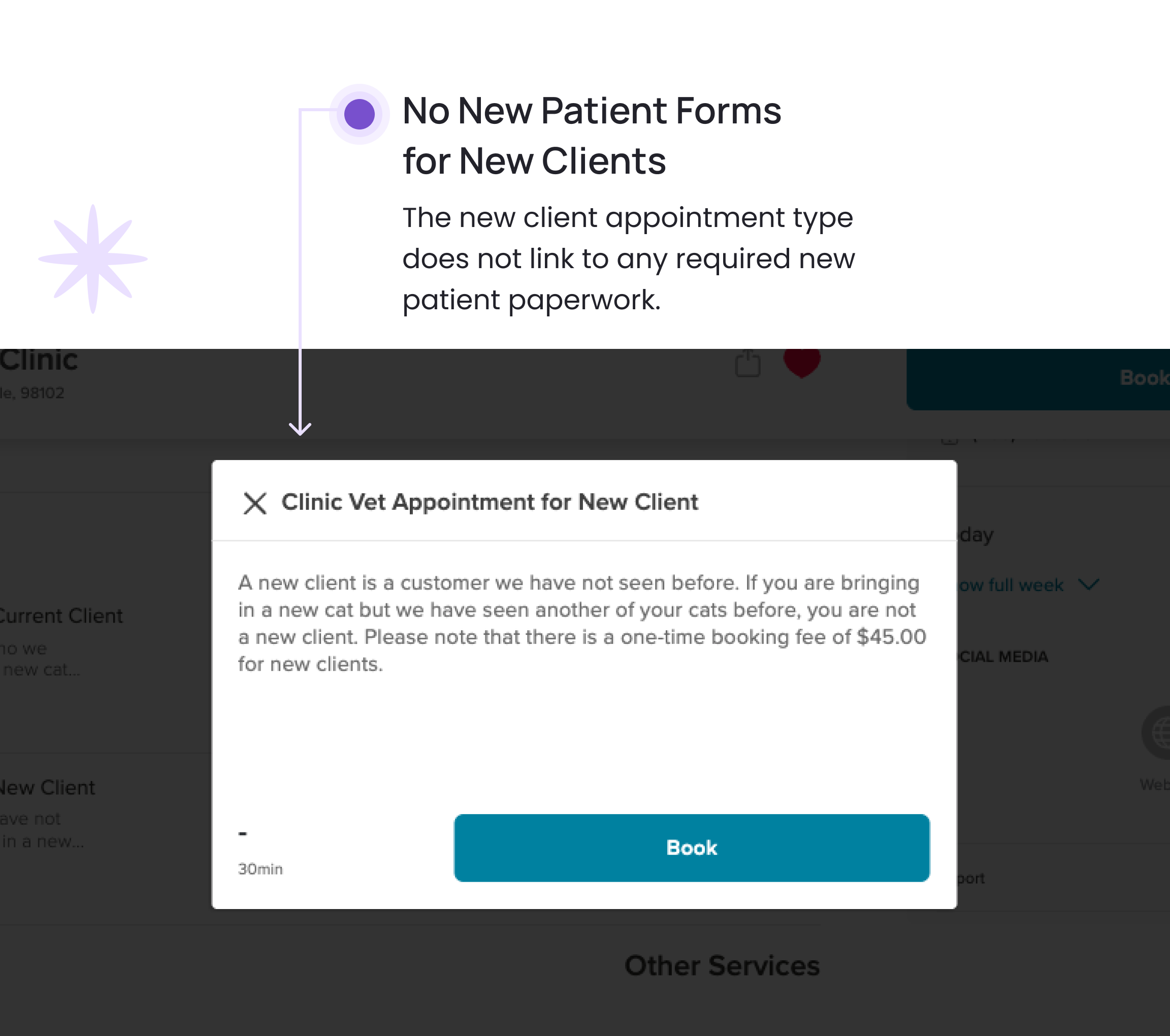
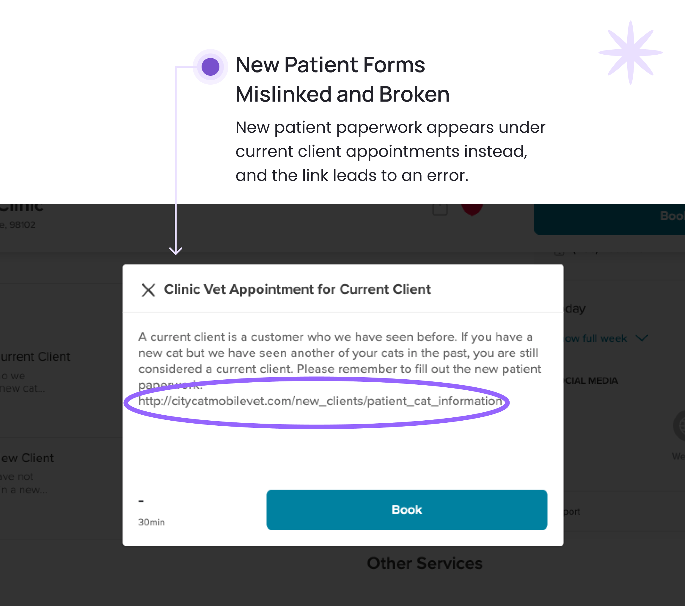
City Cat clients are limited to email communication or the third-party booking platform, Booksy, which contains inconsistent content. Once an appointment is booked, owners receive no further pre-arrival information.
City Cat’s Booksy Appointment Page
New Client Appointment Information
Current Client Appointment Information
2. Impersonal and inefficient information experience
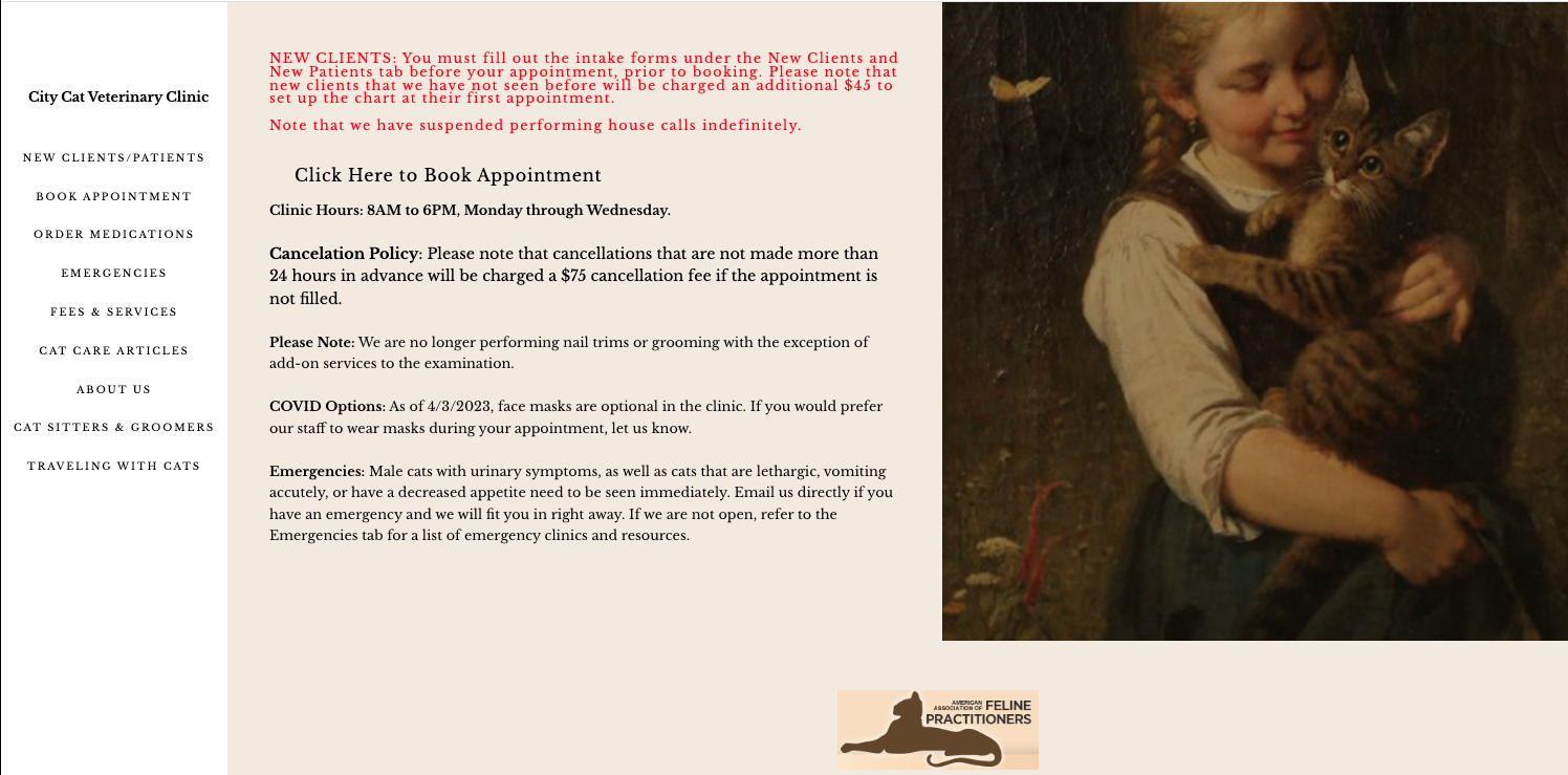
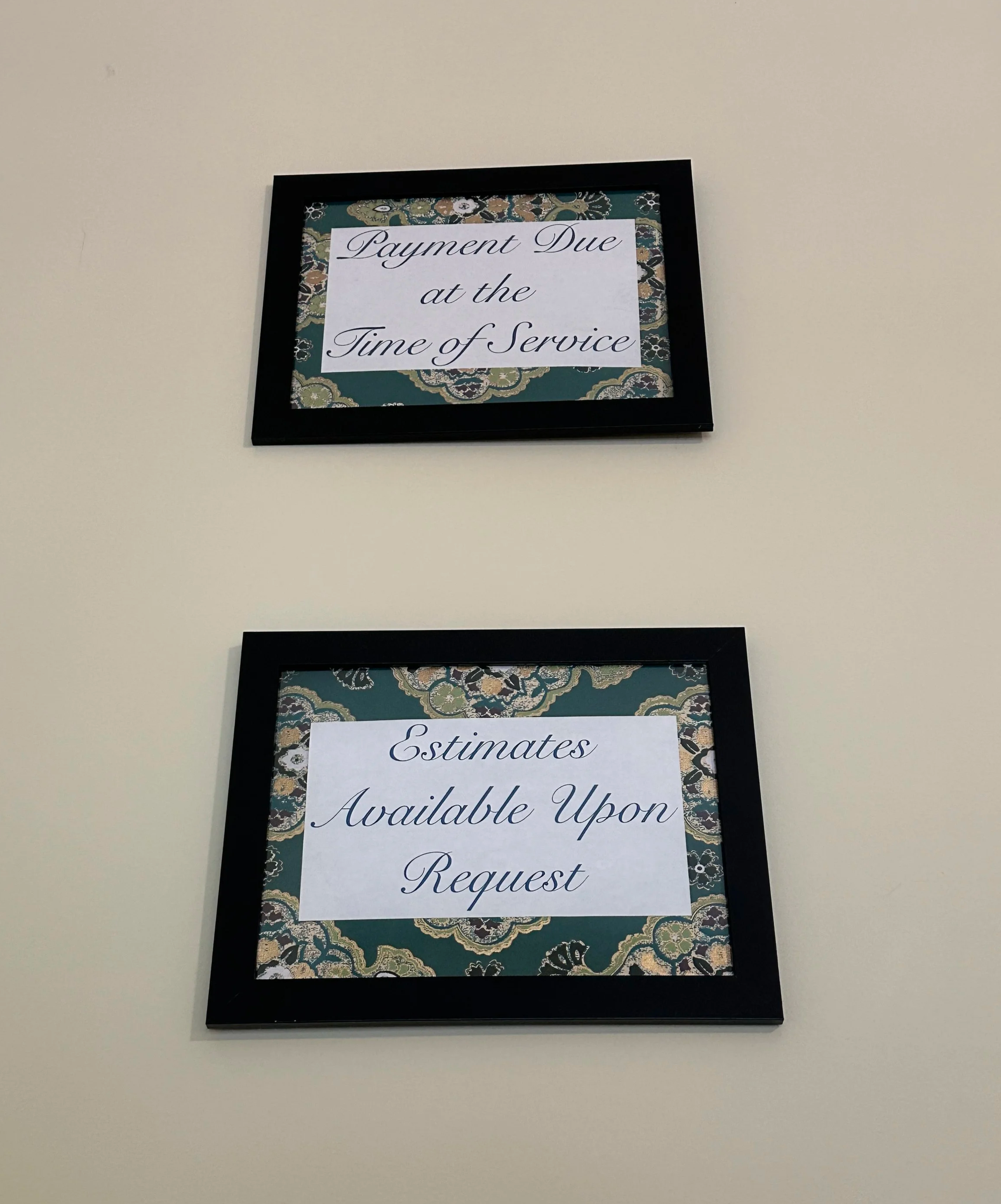
The non-proactive and generic content make preparation confusing, leaving clients to sift through unrelated information to find what truly matters for their needs at the right time.
On the clinic website, clients encounter a broad, wiki-style format that fails to deliver clear, relevant guidance tailored to their specific visit.
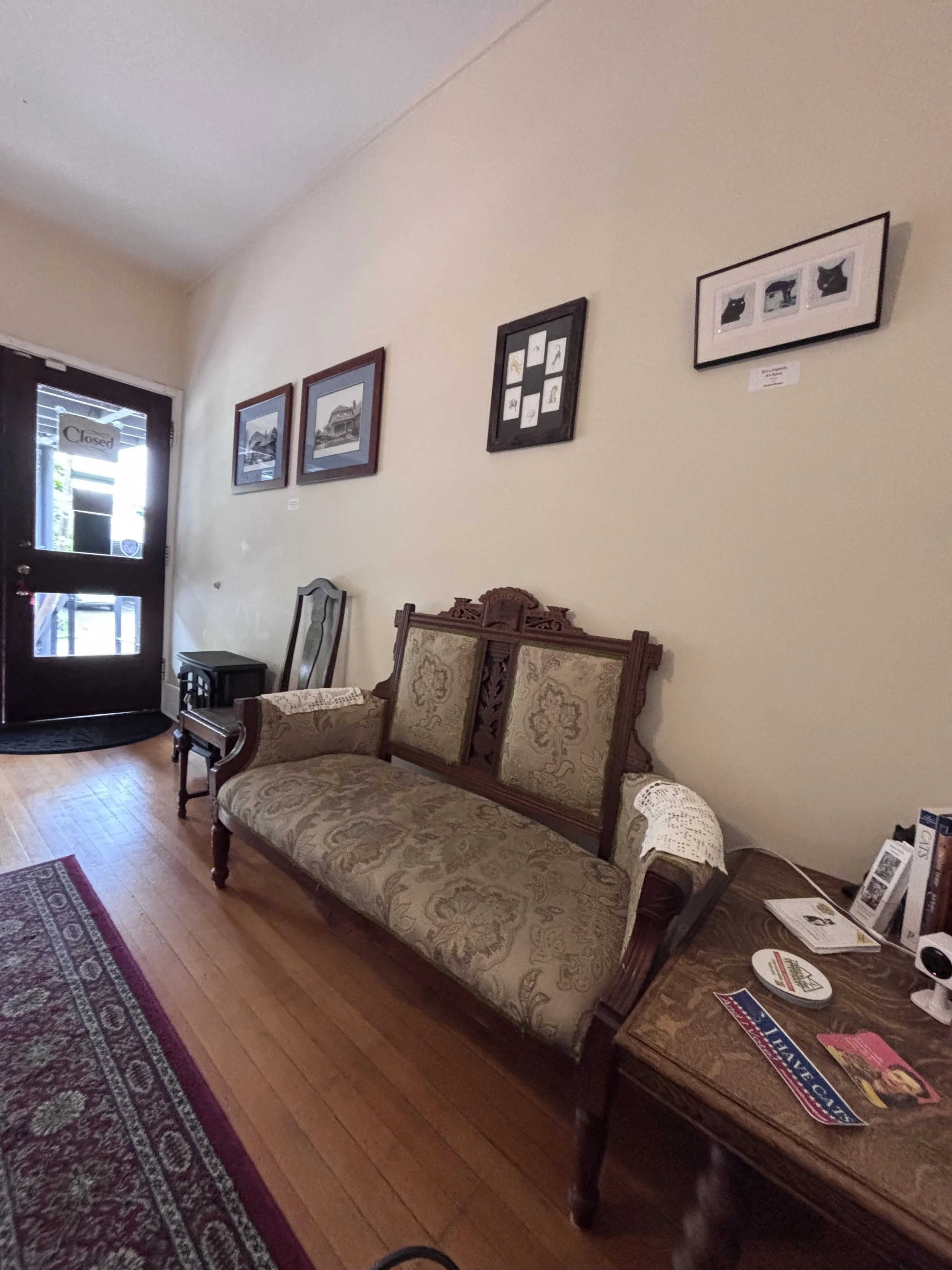
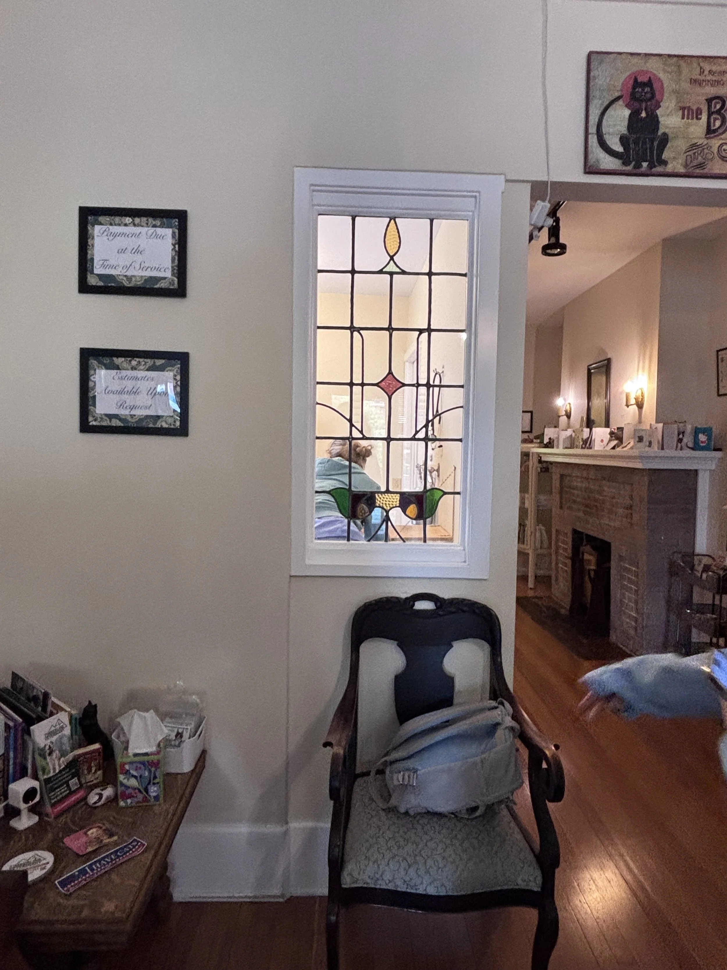
Important messages about about payment are delivered generically in clinic signage rather than customized, digitally in advance.
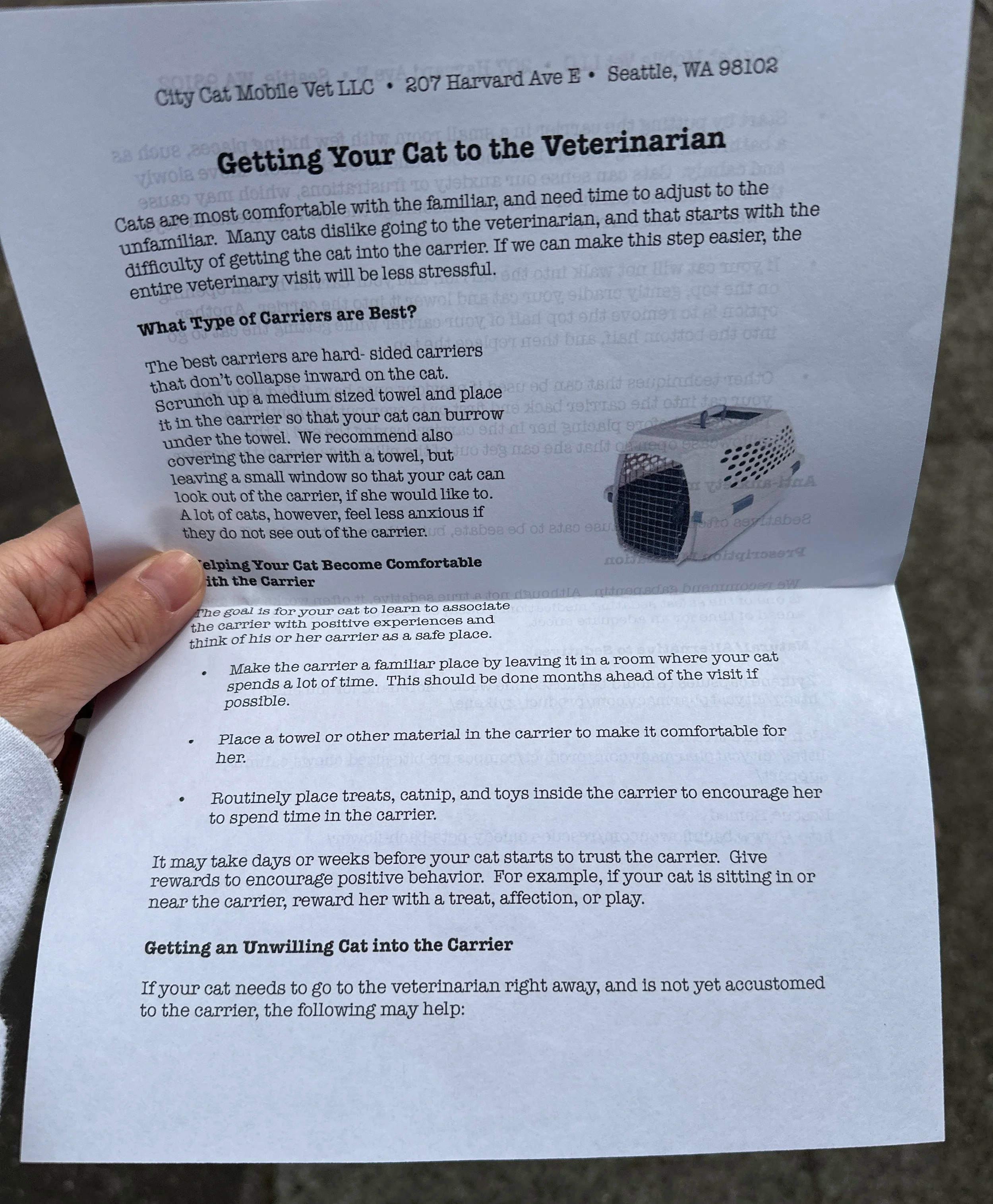
Handout at the clinic about preparing your cat for a vet visit is available, but after arrival.
3. Lack of private space
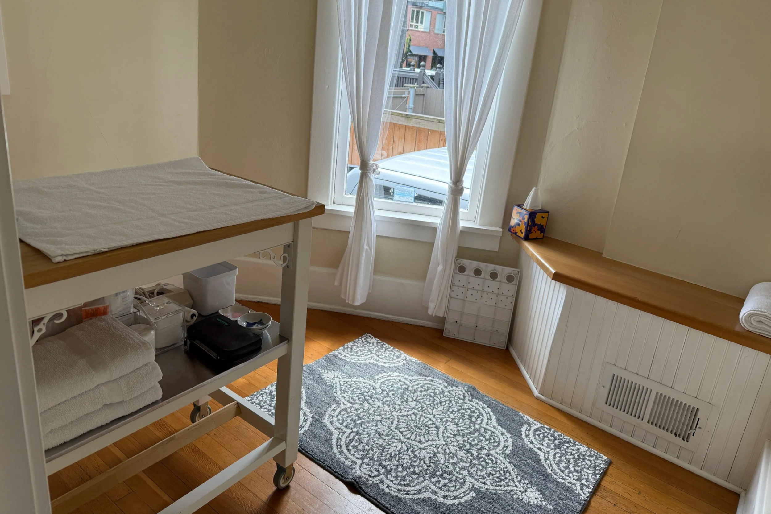
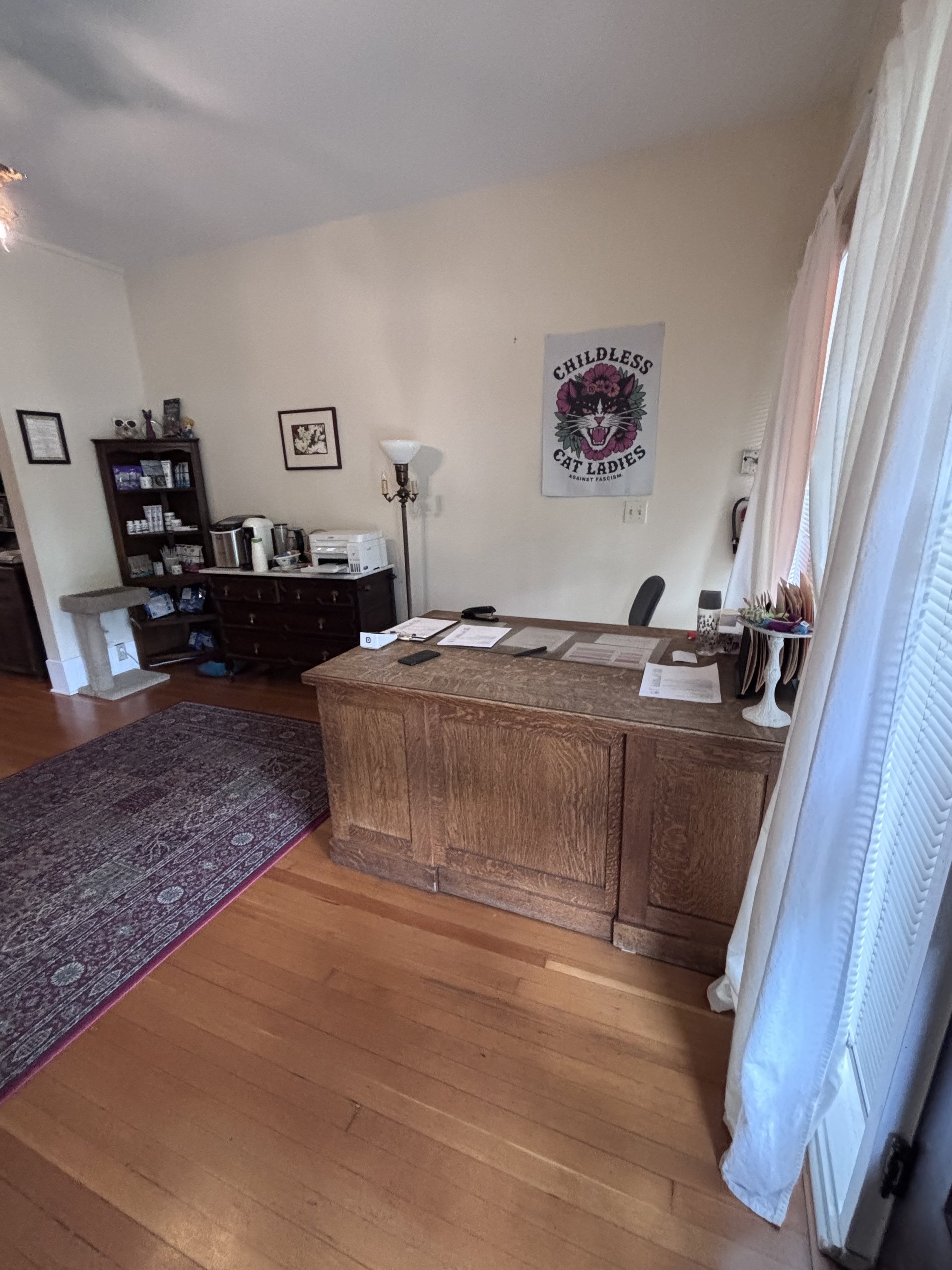
The clinic, while homey, is small. The waiting area has limited seating with noticeable noise from the printer and a window that looks into the first exam room.The small space allows sensitive front desk conversations to be heard throughout the clinic.
SCOPINGThe booking‑to‑check‑in phase carried the highest concentration of friction and confusion
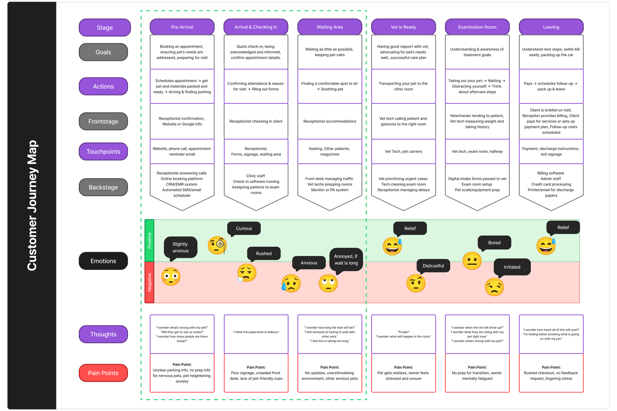
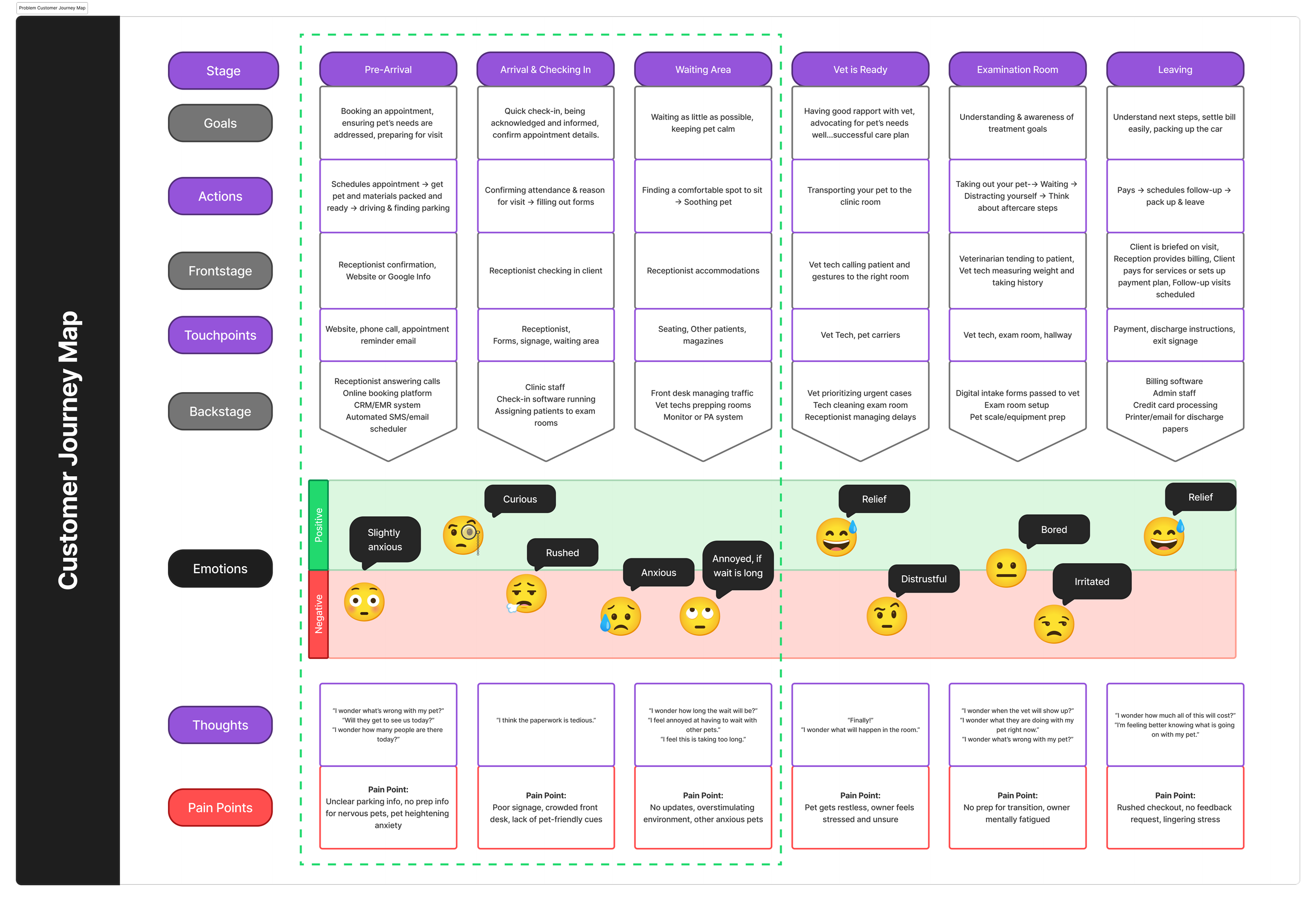
Our customer journey map of the virtual appointment experience showing that the booking‑to‑check‑in phase was not only the most friction‑heavy part of the journey, but also where trust and first impressions were set.
Booking, check in, and pre‑visit prep already happen through digital channels, so improving them was the fastest way to reduce client anxiety and set clearer expectations without changing the physical space.
Framing the ExperienceWhat if preparing for your cat’s vet visit were like checking in for a flight?
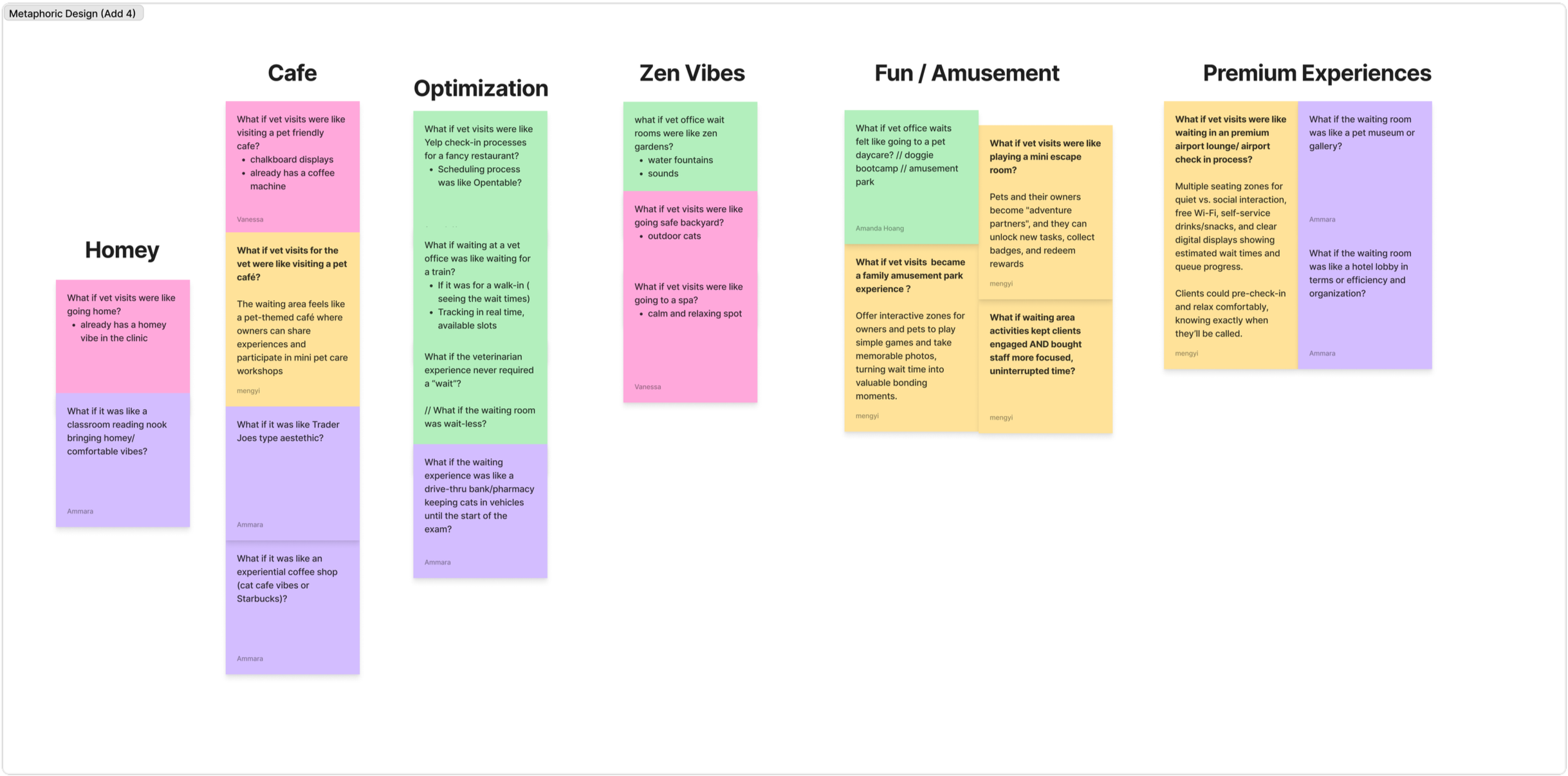
To generate design experiences, I embraced metaphorical design (Kensing & Madsen 1991), where one develops possible solutions by likening one thing to another in the form of “What if X were like Y?”
Metaphoric Design Ideas: “What if X were like Y?”
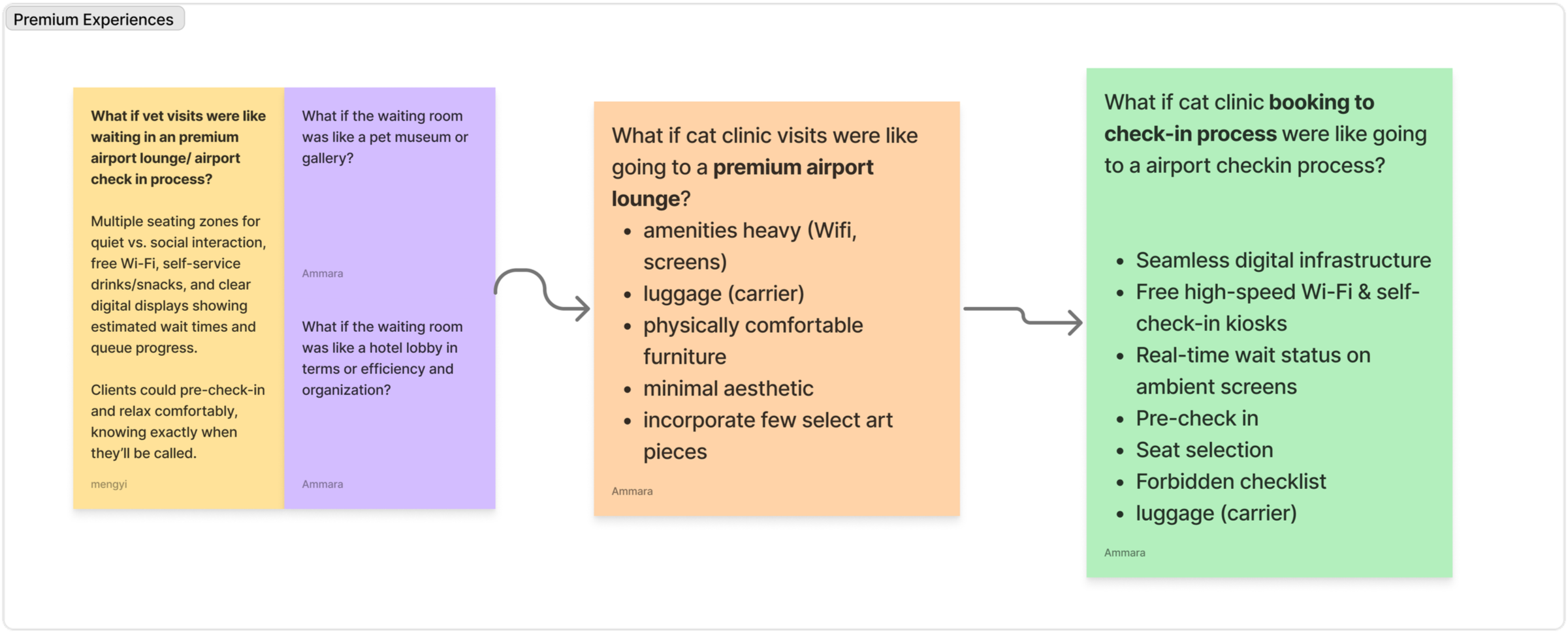
The idea that resonated strongly amongst the team was “What if taking a cat to the vet as akin to flight check-in or a visit to a premium airport?” This metaphor draws on the parallels of pre-visit chaos, while leveraging the way airlines/airports have mastered preparing and comforting passengers before their journey.
Narrowing in on premium experiences, specifically that of airport lounge.
Design PrinciplesDesigning an emotionally supportive booking‑to‑check‑in journey
By asking the clinic to describe their ideal client experience we combined these answers with insights from client interviews, observations, and key problem areas, so that the design was grounded in a set of principles to deliver on the following priorities.
Prioritize Cat and Owner Comfort
Foster calm, respectful experiences before and during visits.
Showcase Clinic Character
Highlight City Cat’s unique philosophy cat‑centric practice and homey charm of a small neighborhood clinic.
Effortless and Clear Early Touchpoints
Design features to be simple, predictable, and easy to follow, so clients never have to guess what to do next.
I used the design principles to further guide me in down-selecting activities and feature ideas within our airport metaphor to address the key findings we outlined.
Ideation & Prototyping Building out the solution for testing
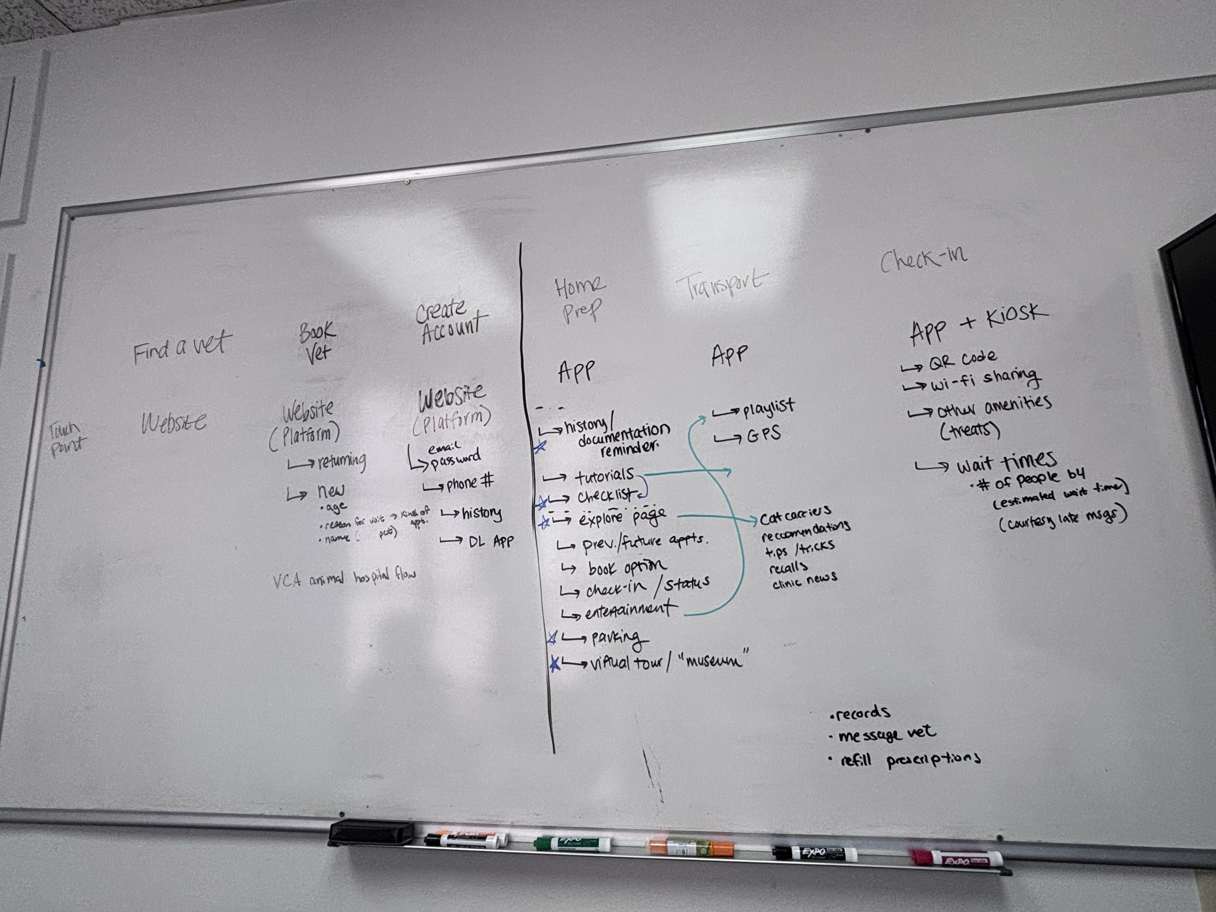
As a team, we wanted to do a card sort to understand what information cat owners would prioritize in an app. Because we had limited time, I recommended that our team use a paper prototype for the first round of testing. To prepare for the first prototype:
I analyzed the pain points from the pre-arrival experience to view opportunities.
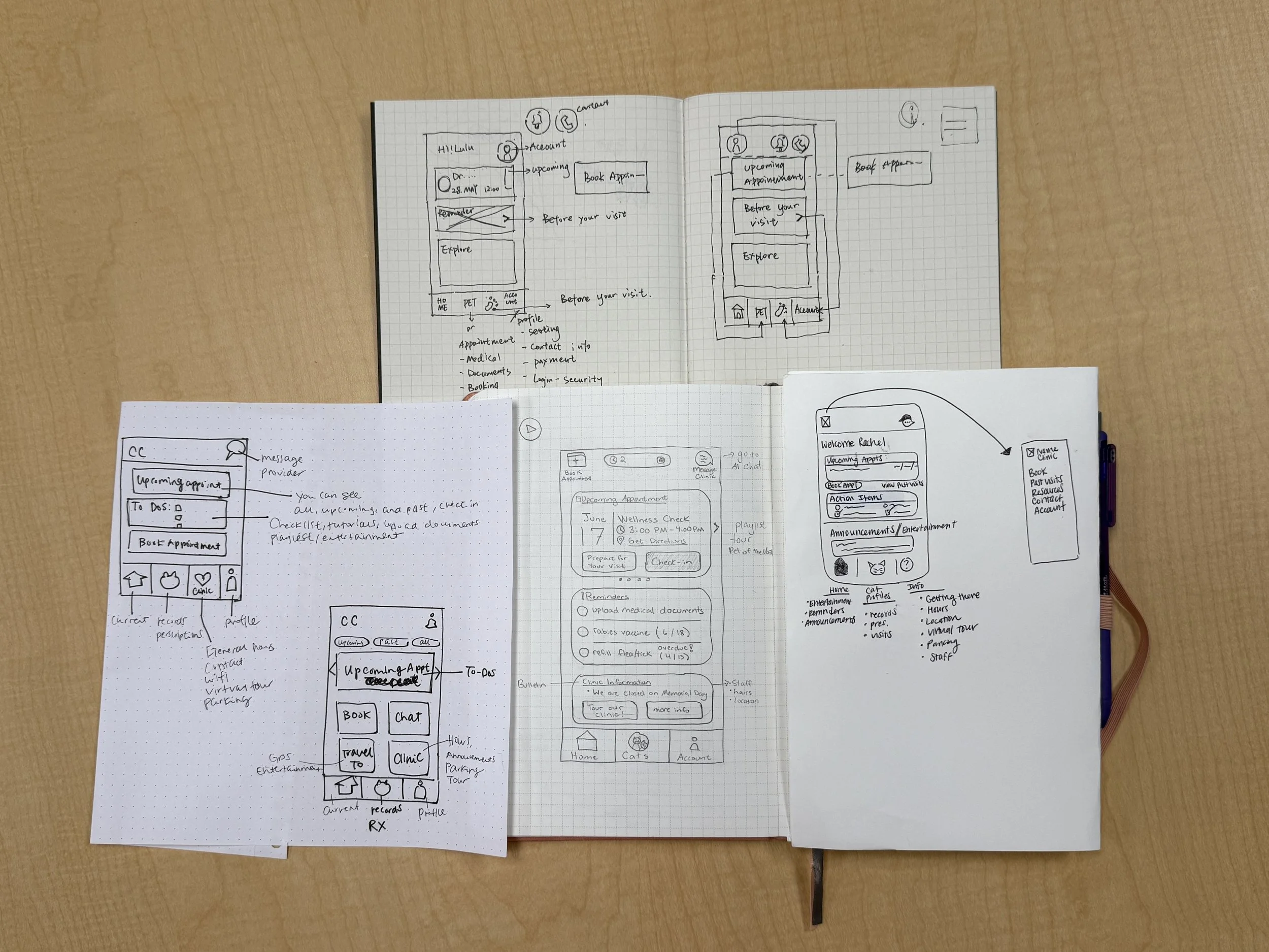
Each of us designed our own version of the home screen and extracted the most effective overlapping ideas for our paper prototype card sort.
Formative Evaluation How do users envision the home screen?
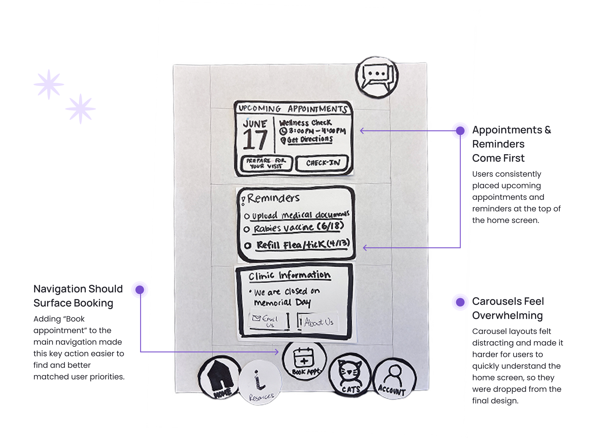
Next, I led in-person card sort with cat owners, asking the user to arrange existing cards or create new ones for how they would envision a mobile home screen for this app.
From the final three different user configurations of the home screen, we finalized a reference layout of the mobile home screen to move into digital prototyping.
Finalized Home Screen
Summative EvaluationRefining user experiences with high-fidelity testing
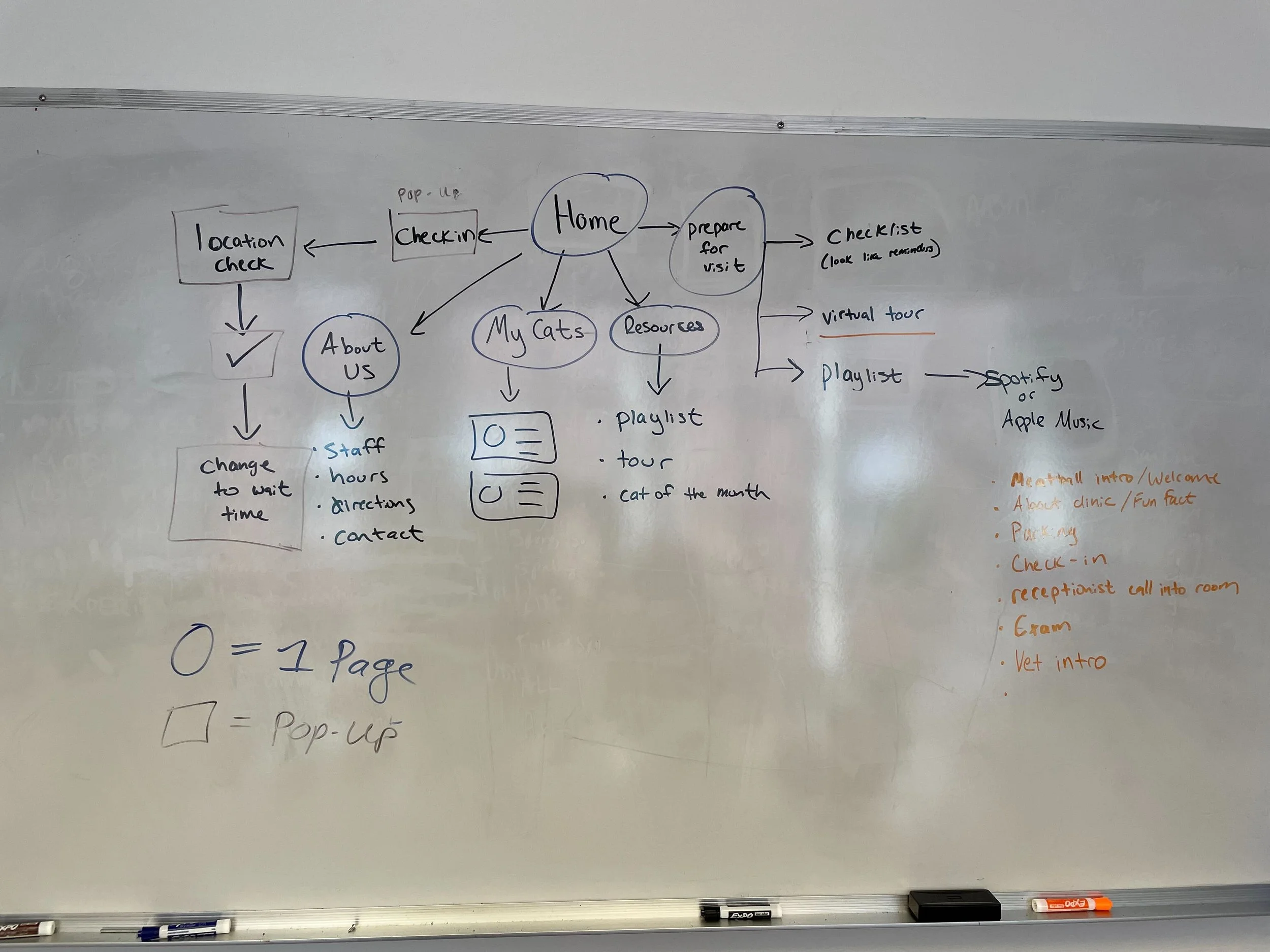
With the home screen confirmed, I referenced airline apps like United, Delta, and Alaska to inform the broader app flow before translating everything into a high-fidelity prototype. I then ran a 60-minute remote usability test with cat owners to validate the end-to-end experience.
United, Delta, and Alaska Airlines served as reference points for the high-fidelity prototype.
Final IterationsUsability changes and resulting designs
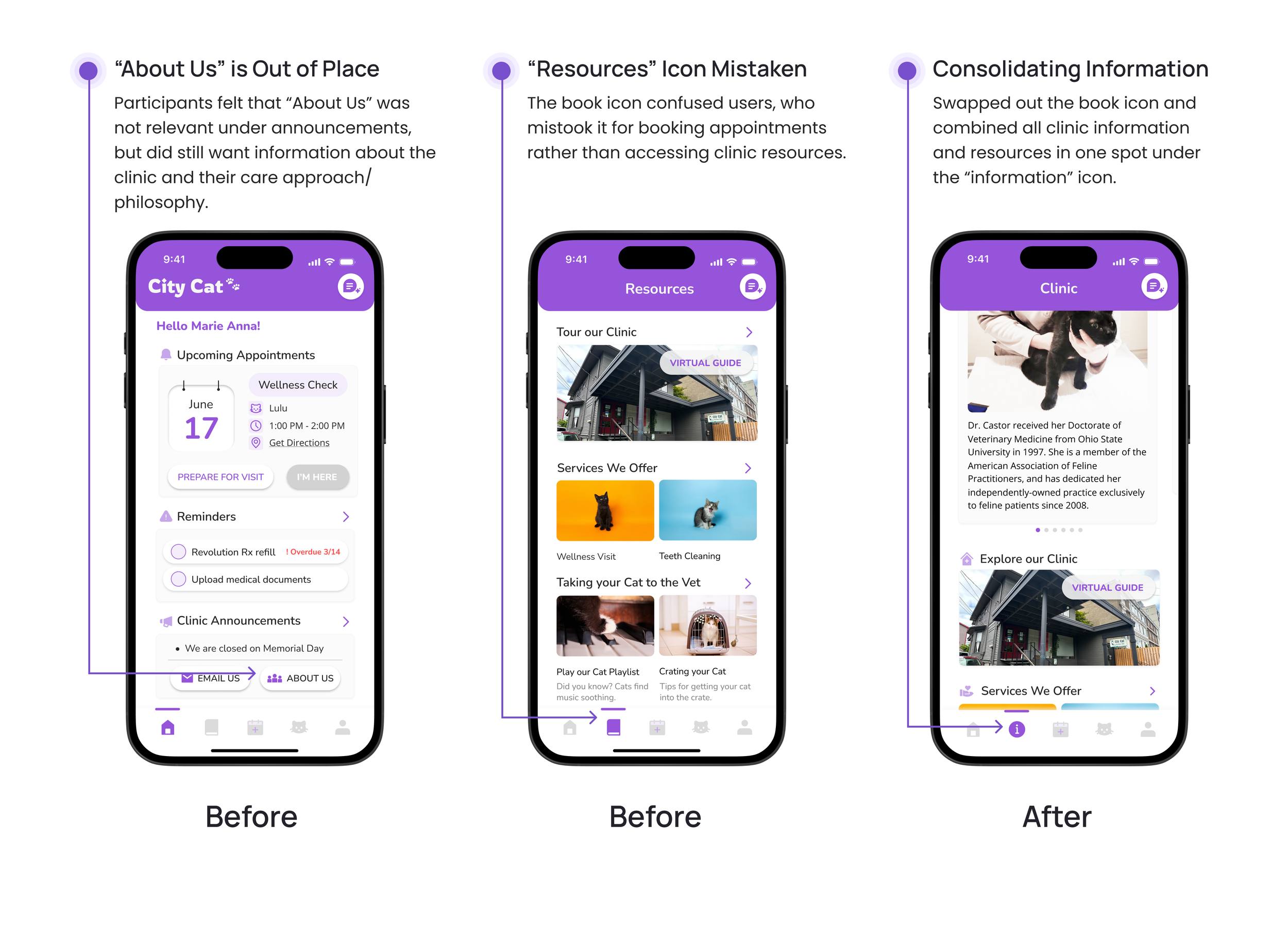
What follows is a breakdown of the solutions developed through continuous user feedback and testing, culminating in our final iteration designs.
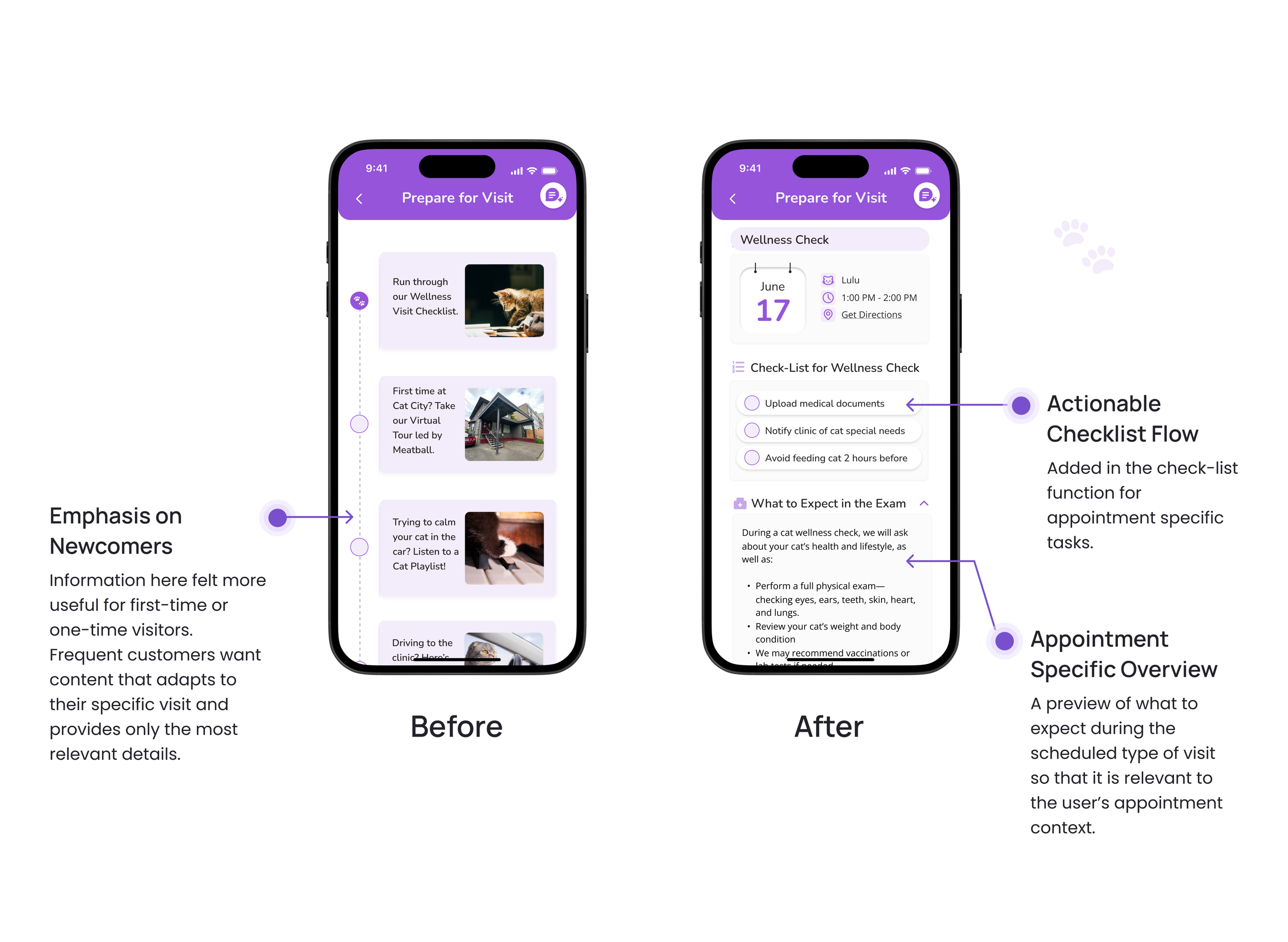
Users found resources helpful, but not enough to warrant two different pages
Users wanted not only pre-visit guidance, but also a clear outline of what to expect during the appointment itself
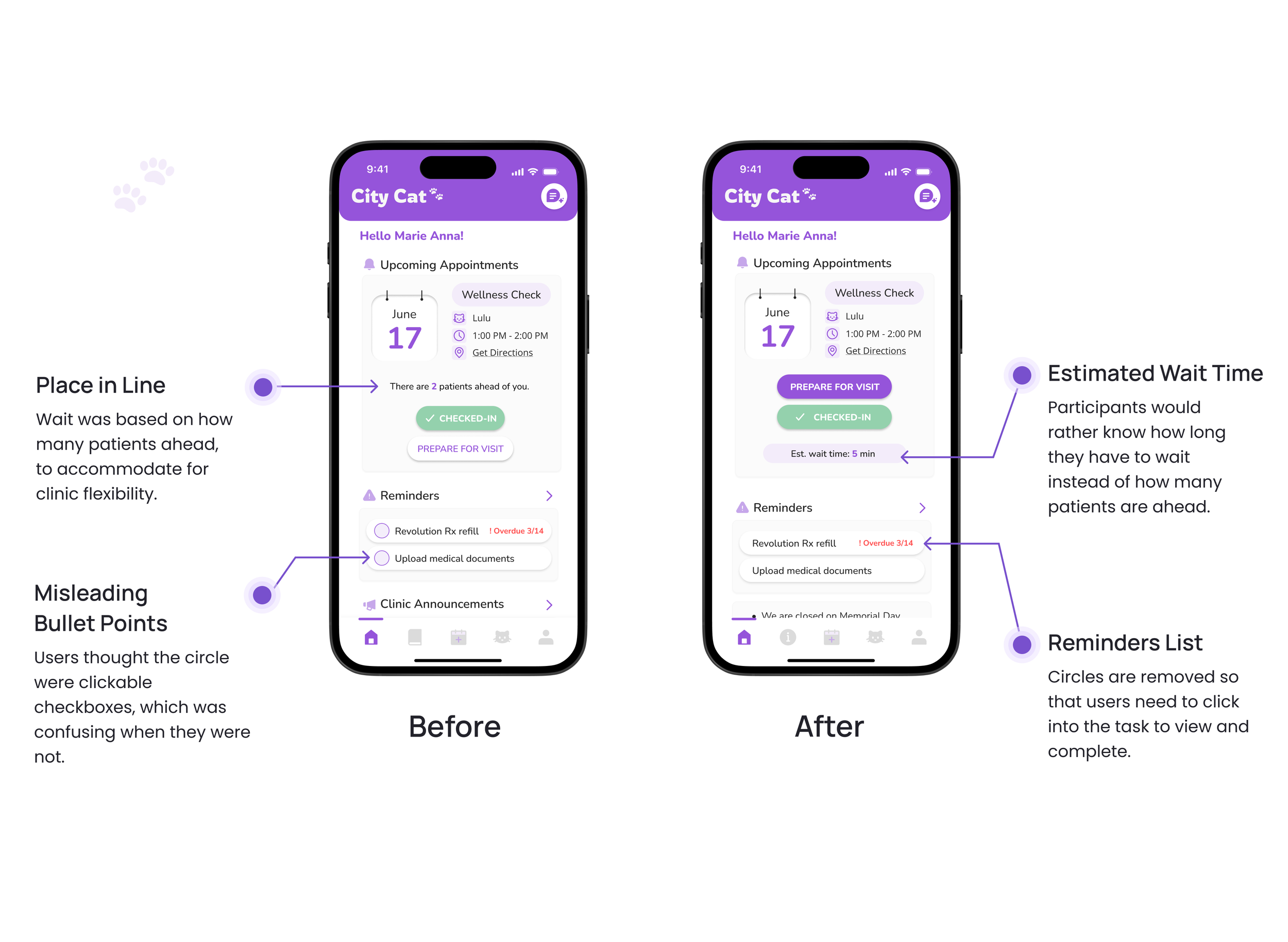
Overall homepage impressions were positive, but needed slight adjustments to how they were updated on wait times
ImpactIncreased preparedness and calm
Prospective clients responded positively to the concept. When asked to rate their confidence and preparedness after using the prototype, participants gave an average score of 8.2 out of 10, demonstrating strong perceived value.
“Usually before I go to a new place or visit the clinic, I will get anxious… this app helps make me feel less anxious because I can do check-ins and prepare for the visit.”
-P2
Stronger sense of care
The app shifted how participants felt about the clinic, making it feel warmer and more caring. This qualitative signal suggests the experience can build trust and emotional safety before arrival.
“From the visuals, it seems homey… It makes me feel like they really care about my cat and making sure we have a good visit.”
-P3
Potential to drive loyalty and differentiation
Participants saw the app, especially the interactive tour, as a differentiator that could influence their choice of clinic. All three participants loved the tour, indicating it could help this clinic stand out from competing vets.
“If this app is implemented… it might be the reason I will keep visiting this place and having my cat be a customer all the time.”
-P2
ReflectionMetaphoric design as an inspiration
Balancing stakeholders
In terms of lessons about experience design–metaphors are meant as a helpful guide, not an exact blueprint. You still have room to deviate away from certain aspects of the metaphor if it isn’t meeting the needs of the user. For example, our cat playlist was not as important as we thought it would be for “lounge” music, so we deprioritized it.
With the design of our solution, I also realized that we focused a lot on preparing the user for their visit (service provider perspective), but equally important is the user’s perception of the clinic being ready for them. If I had to do this project again, I would definitely incorporate this service recipient mindset equally if not more.
Next steps
Our experience solution focused more on first time clinic clients as well as unintentionally provided more information skewed towards those with cars as well. Although making first impressions are important, so is being able to continue to provide new useful information for returning users as well as being more inclusive for different types of client needs.

