
-
Optimizely Overture
An AI-powered web platform that guides small-to-medium business marketers through Optimizely, simplifying A/B test setup and analysis to directly combat the platform's highest source of customer churn.
The solution elevates user confidence and engagement by integrating a proactive AI assistant, clear visual guides, and a "Launch Readiness" monitor, ensuring customers can consistently run successful experiments.
My Role
Product Designer
Skills
End-to-end Design
Interaction Design
Information Architecture
Visual & UI Design
User Flows
Team
3 Product Designers
1 UX Researcher
1 Optimizely Product Manager
Optimizely Head Of Product
Timeline
6 months
The problemA/B testing platforms like Optimizely’s Web Experimentation (WebEx) can be a powerful but confusing tool to use for newcomers
Small-medium businesses who use Web Experimentation struggle to launch successful tests and leave the platform for other solutions that fit their experimentation needs or abandon experimentation efforts altogether.
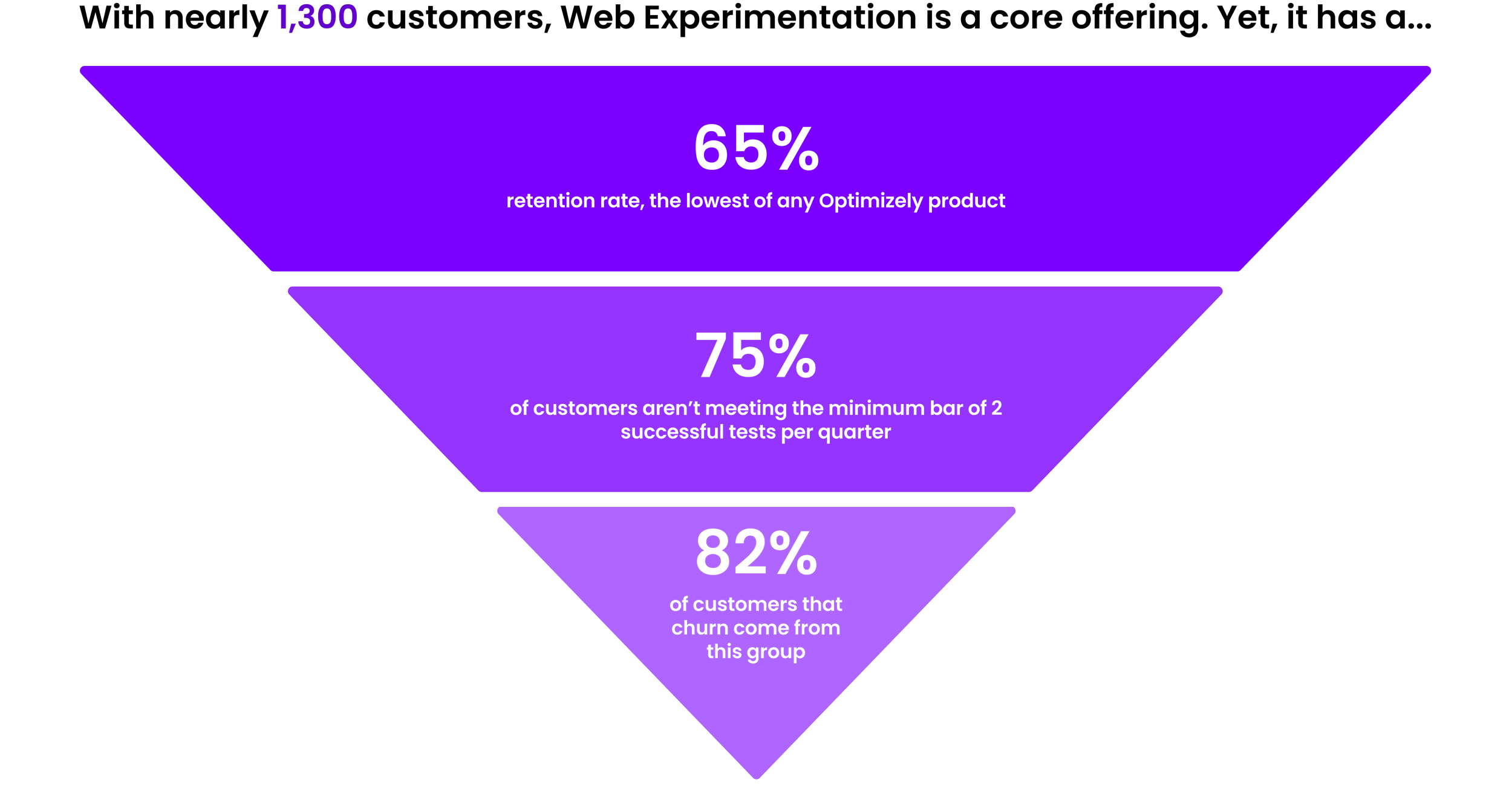
Meanwhile, Web Experimentation customers can pay more to get dedicated support during onboarding, but for those who don’t purchase this service, Optimizely’s Customer Success team can intervene as a last resort to re-engage struggling users, creating additional workload and delays.
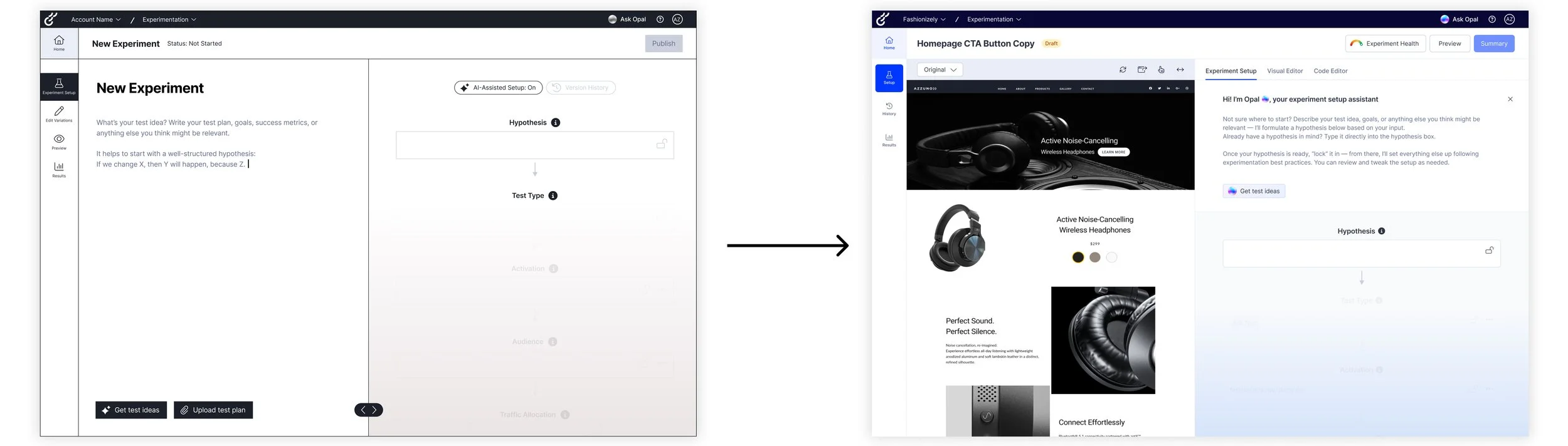
SolutionMeet Opal: the proactive AI assistant
Thoughtfully embedding Optimizely’s existing AI, Opal, across all stages of test set-up: from creation to launch, analysis, and iteration.
This accelerates test setup and design while guiding customers through best practices that empower all users to run smarter, more effective experiments.
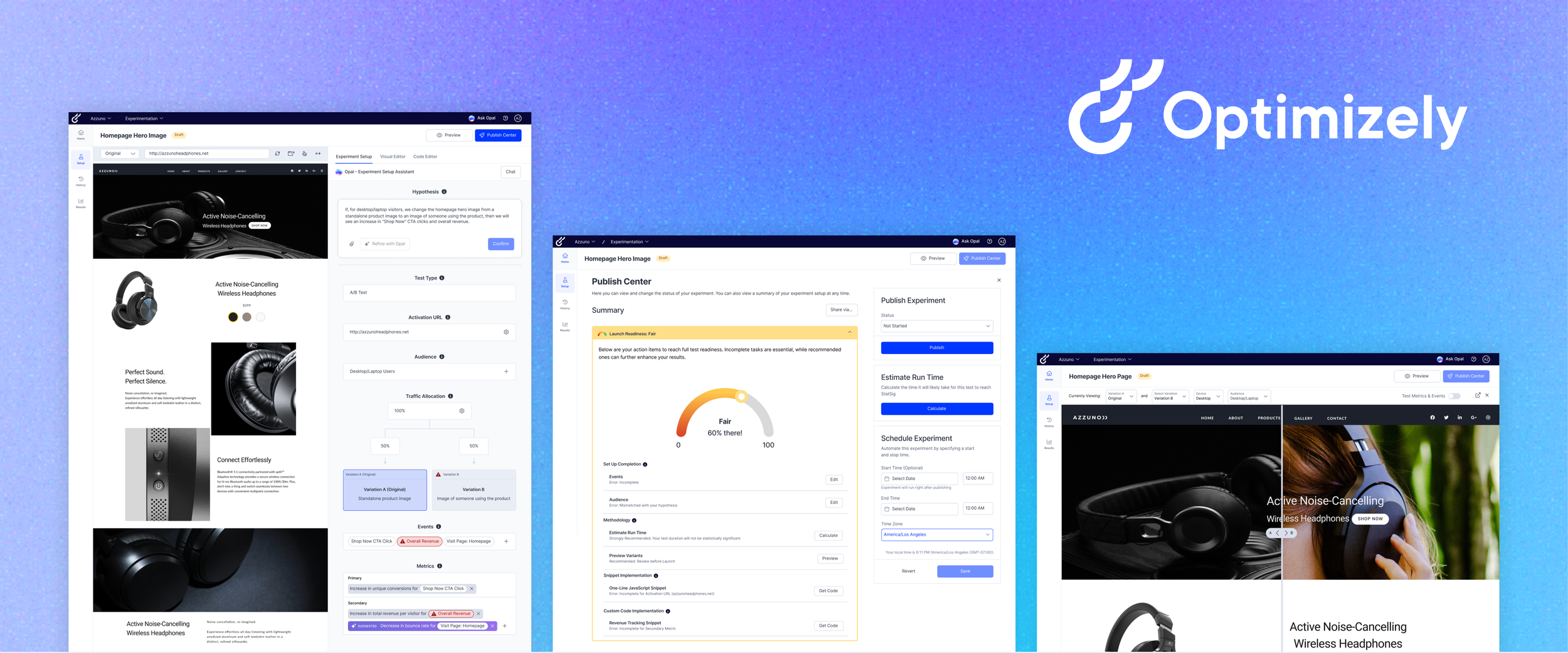
Show don’t tell: unveiling the connections during experiment setup
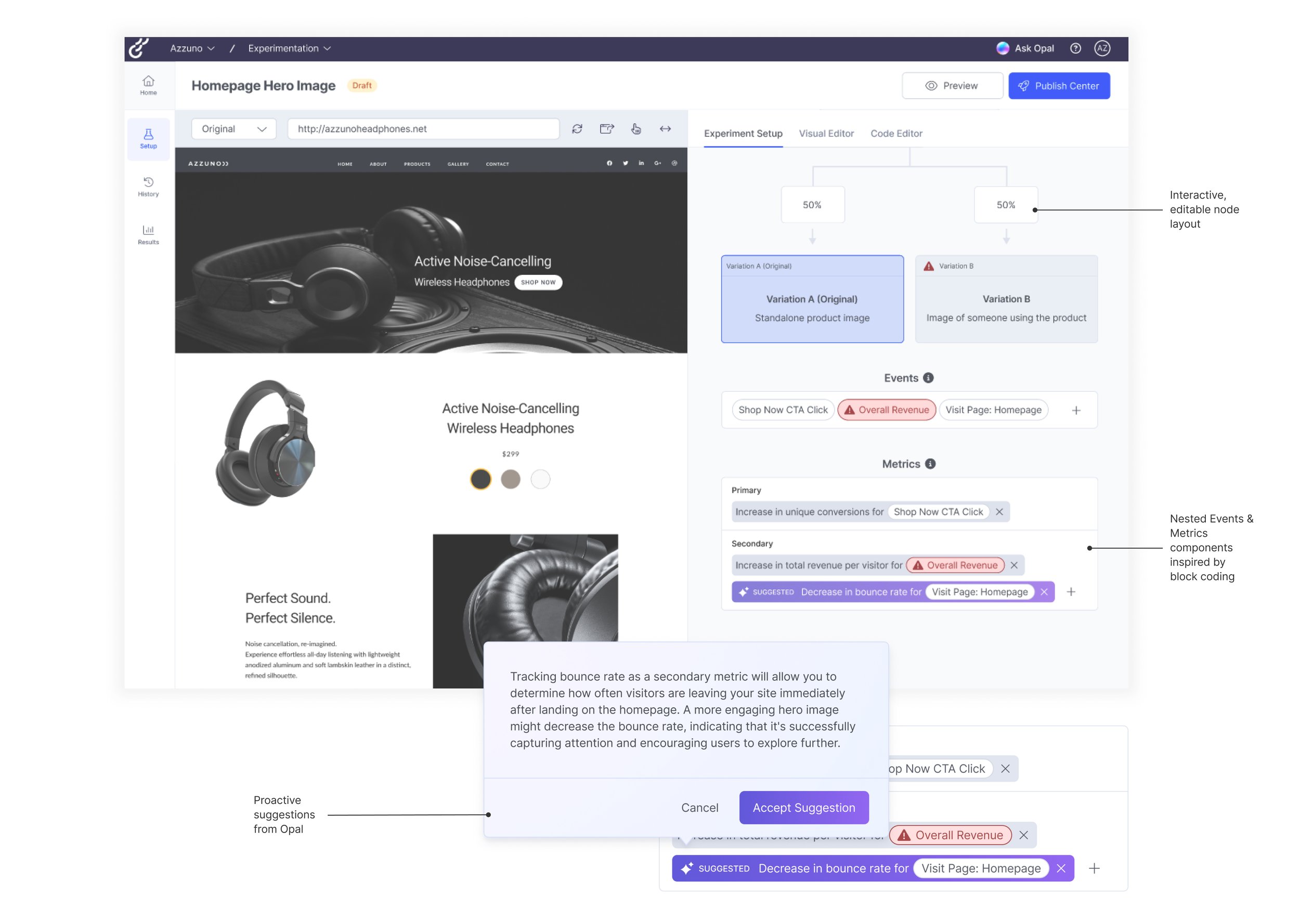
Overture organizes key set up elements in one clear, interactive node layout paired with the visual editor. This makes it easy for users to follow each step, build their experiment smoothly, and see their progress at a glance.
Launch confidently: checkpoints for every step
A redesigned preview, Launch Readiness monitor, and a new publish center to ensure customers can launch their tests without worry.
ImpactOverture's design solution is projected to boost user confidence, accelerate experimentation, and improve retention
45%
Fewer experiments running longer than two months.
With clearer statistical guidance, users can reach significance more quickly and confidently conclude tests.
50%+
Churned ARR (Annual Recurring Revenue) pain points directly addressed for SMBs.
Targeted solutions now make experimentation faster, easier, and more accessible for this segment.
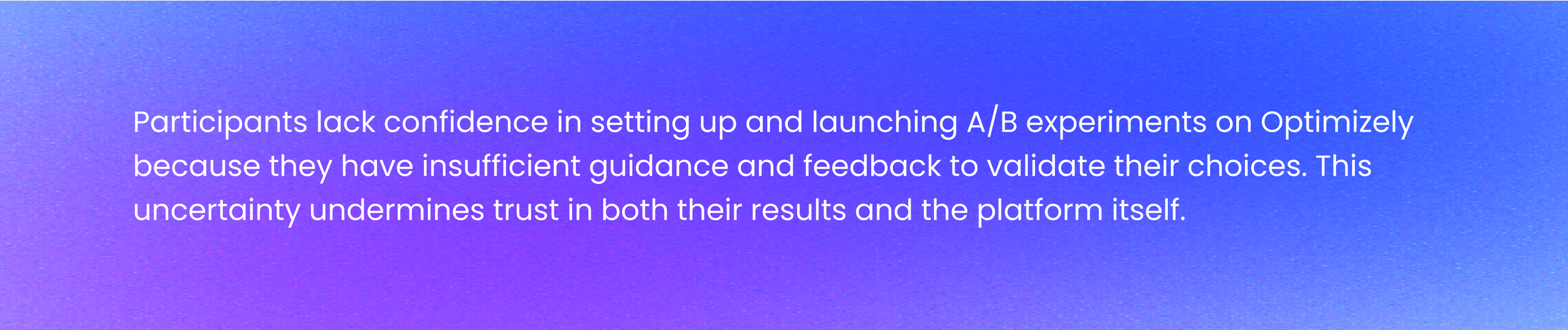
ResearchThe main insight I discovered:
To understand What the early experiences of self-serve users on the Web Experimentation platform are and what was going wrong we:
➜ Conducted desk research, consisting of competitive analysis and a heuristic evaluation of the platform.
➜ Spoke with 5 Subject Matter Experts (Optimizely employees)
➜ Ran 6 contextual usability studies with professionals who have A/B testing experience but have not used Optimizely WebEx
Key findings

Many customers quit because of issues using the platform, due to lack of help, hidden steps, and roadblocks within the test-setup process. Our findings revealed the need to fully transform the setup process to improve the customer experience.
➜ Click for the final Research Report
DESIGN CHALLENGE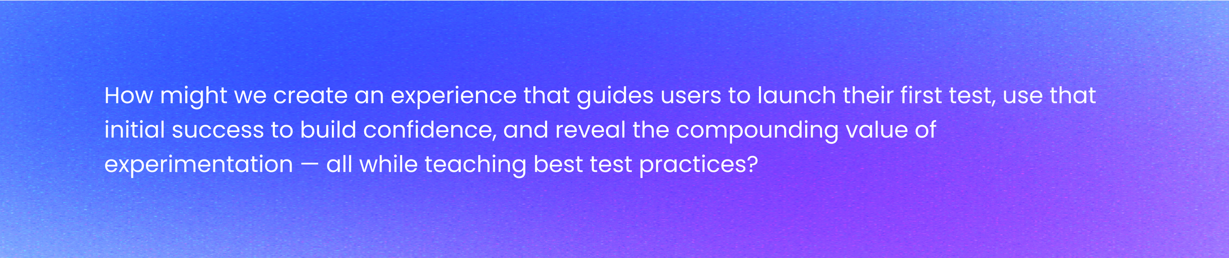
Mapping the Experiment Set-Up JourneyPutting together a Journey Map to break down an experiment set up flow
It helped us capture user emotions along the way and highlight where people got stuck, allowing us to prioritize pain points and uncover key opportunities for improvement.
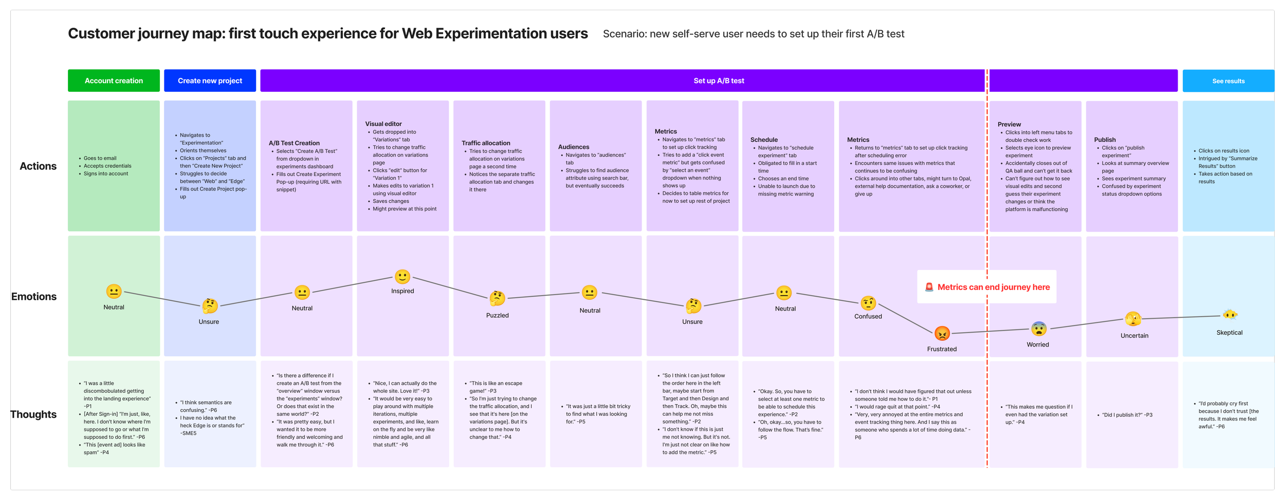
We split the Web Experimentation journey into 4 phases including account creation, create a new project, set up experiment being the bulk of the journey, and ending with see results.
Current Interface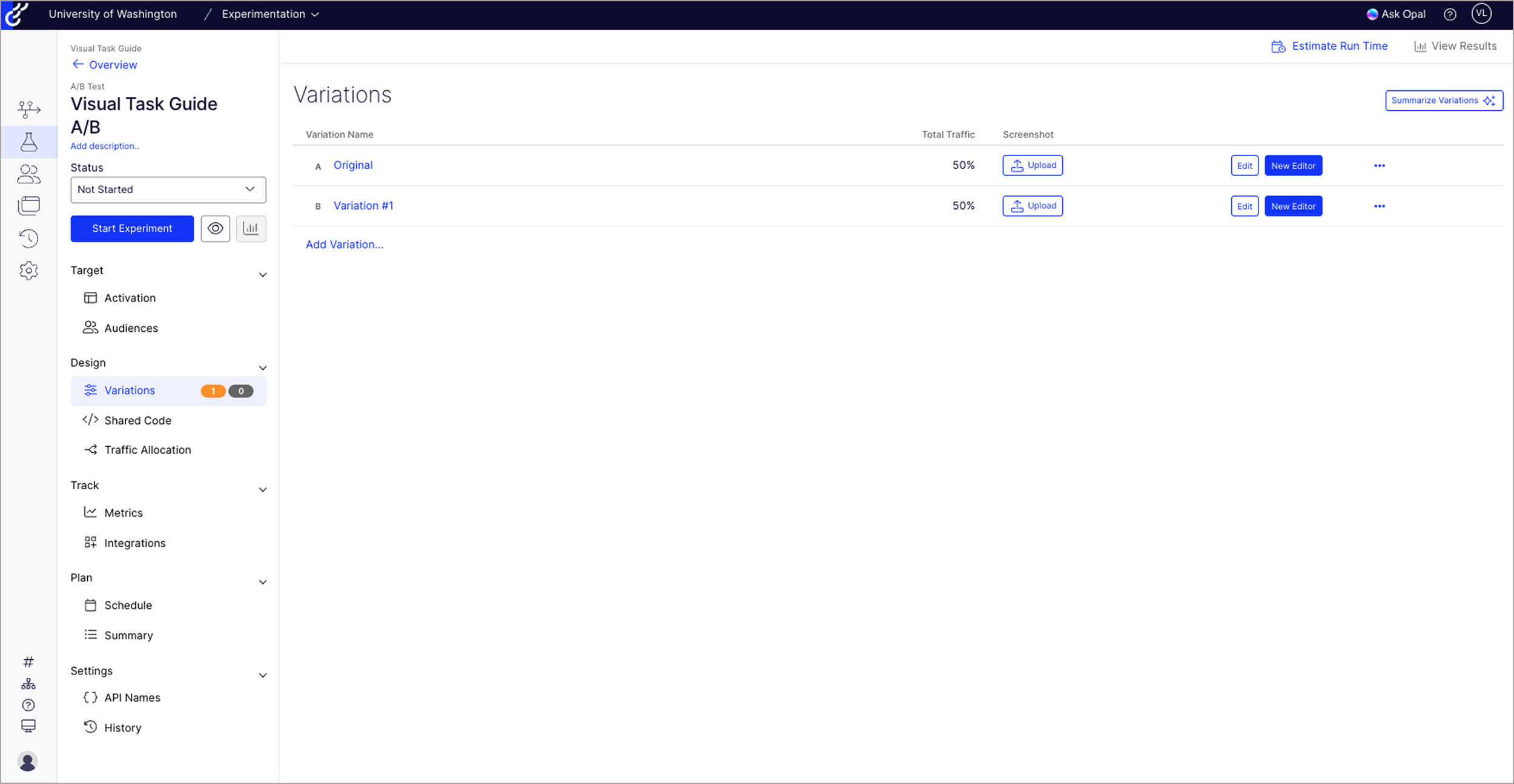
Experiment Landing Page
No guided onboarding or in-product support to help set up first experiment
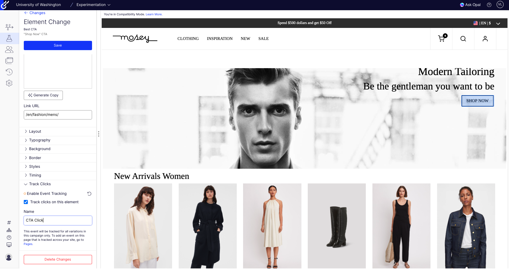
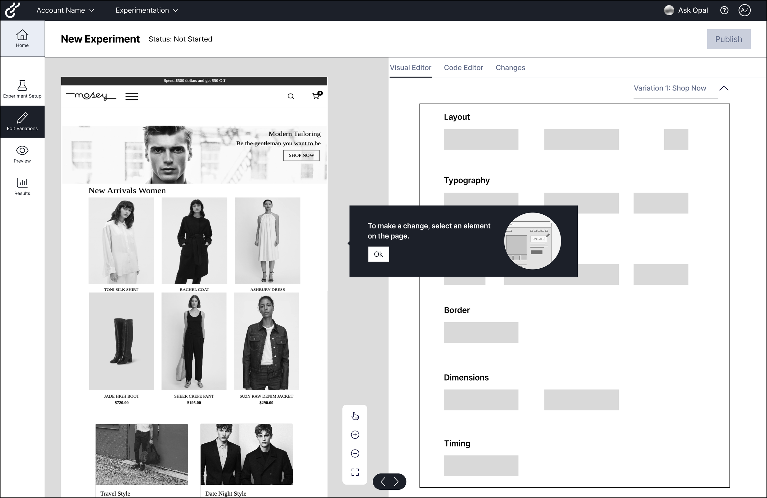
Visual Editor Interface
Inconsistent & unclear terminology with little to no built-in explanations or tooltips
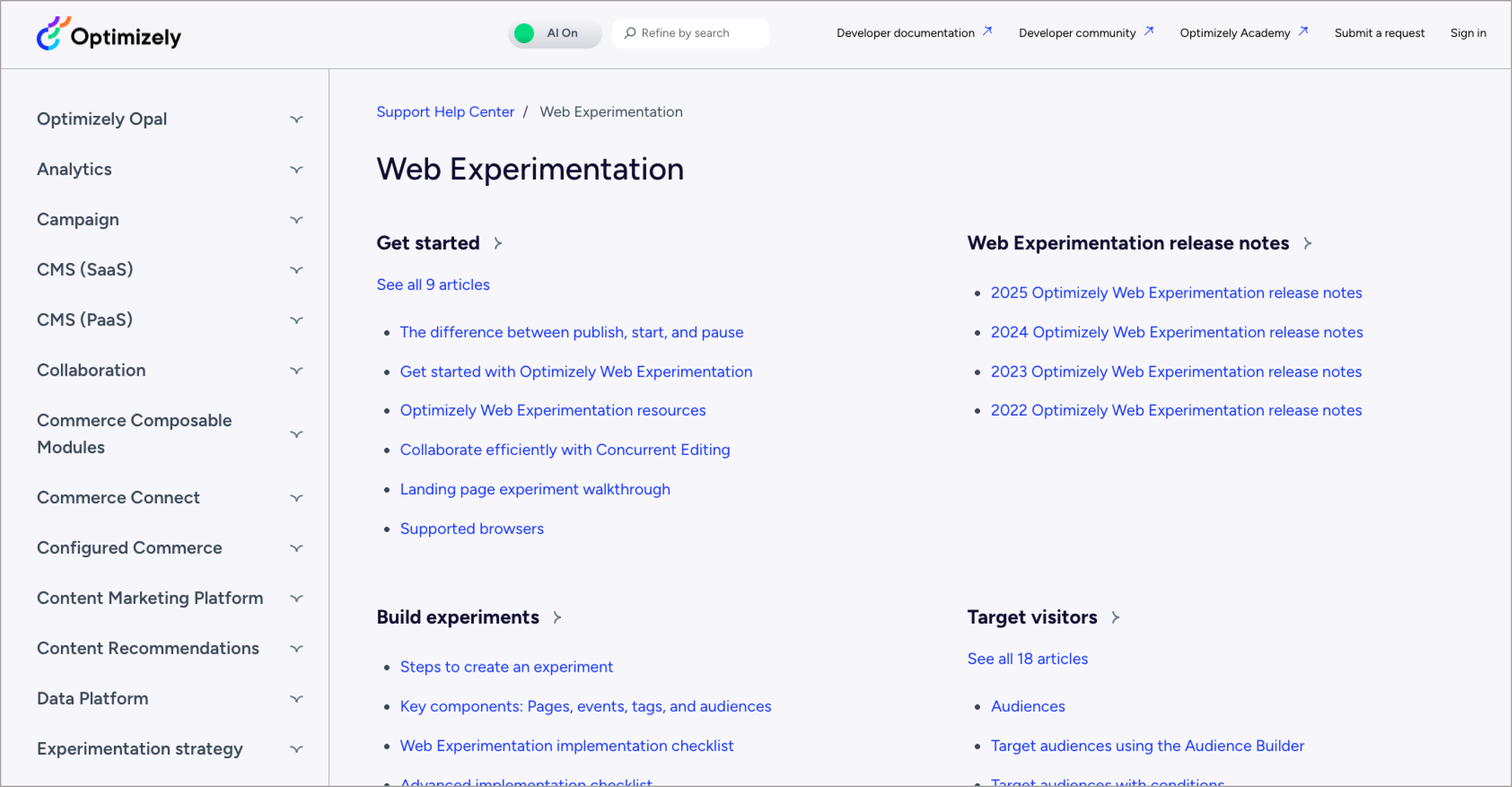
Support Help Center
Heavy reliance on external documentation

Variant Preview
Lack of consistent, visibility of system status
Design IdeationExploring 2 different layouts to reduce complexity and embed help exactly where needed
We started ideation, rapidly brainstorming around 8+ high-level concepts that addressed our how might we statements. Not all of our ideas at this stage involved AI, but we definitely kept AI and Opal at the forefront of our minds during this process knowing that Opal is a huge priority for the future of Optimizely.
We down selected to two ideas that we found to be the most promising:
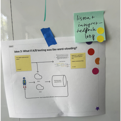
Word Clouding
Users describe tests in their own words ➜ AI generates setup + highlights input mapping.
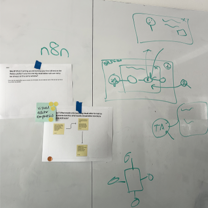
Node Layout
Simplify setup by visualizing all components in one place, modeled as directed graphs of nodes.
Prototyping & Feedback LoopsEnsuring concepts fit with real user workflows
My co-designers and I mapped out a single user flow that combined both concepts into one experience and created low-fidelity Figma wireframes for a split-screen prototype:
Left: Opal AI word-cloud notepad for capturing goals and experiment parameters
Right: node-based layout visualizing the structure of the experiment
We tested this with seven marketing-adjacent professionals with A/B testing experience, grounding feedback in real workflows to ensure insights were contextual and reliable.
1. New experiment interface with a blank "notepad" or word clouding area for users to brainstorm their experiment ideas.
3. Deep dive into Node Layout: nesting Metrics under Event components + Opal AI suggestions.

2. Users enter in "notepad" content for Opal AI to generate an experiment on the right side in a node layout format.
4. Exploring how we might keep Optimizely's unique Visual Editor feature in this design.
Design DecisionMaking the node layout the backbone of the experience
While participants appreciated the Opal notepad, I advocated for prioritizing the visual node layout as the backbone of the experience because users anchored their understanding in visuals and preferred entering pre-formed ideas directly into the nodes.
We removed the AI notepad to reduce redundancy and align the workflow with how marketers naturally conceptualize experiments.
IterationRefining the experiment setup for clarity and confidence
Building on earlier insights, I refined the workflow in high-fidelity, focusing on moments that improved clarity and user confidence.
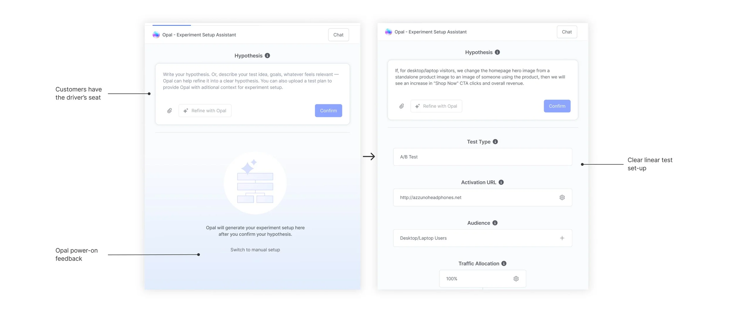
Early Opal guidance
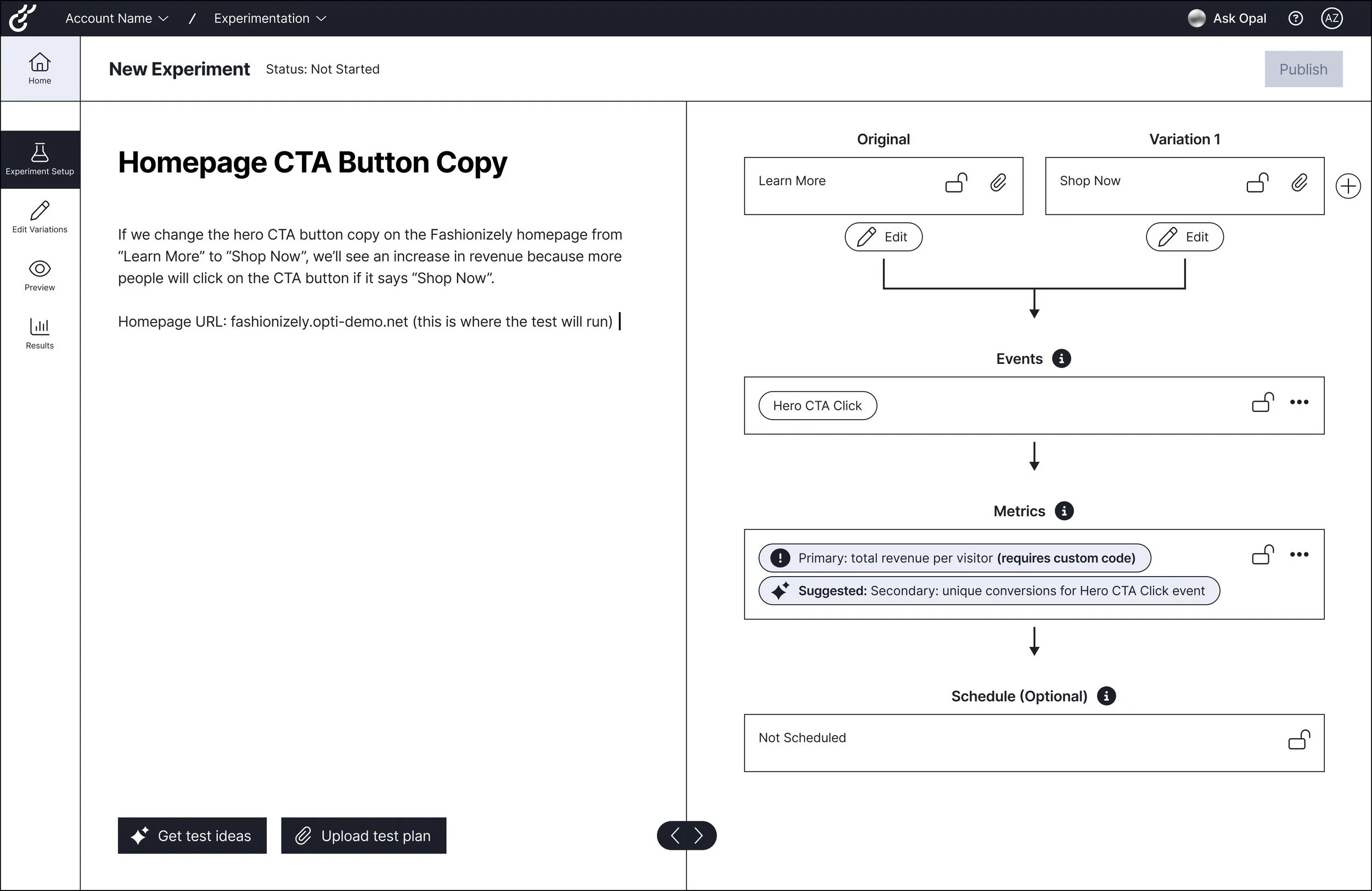
Opal guides initial hypothesis formation.
Users can generate test ideas with Opal, upload a test plan, or enter a pre-defined hypothesis directly into the input field. Once satisfied, they can refine it further in the hypothesis box before confirming, all before any nodes are generated.
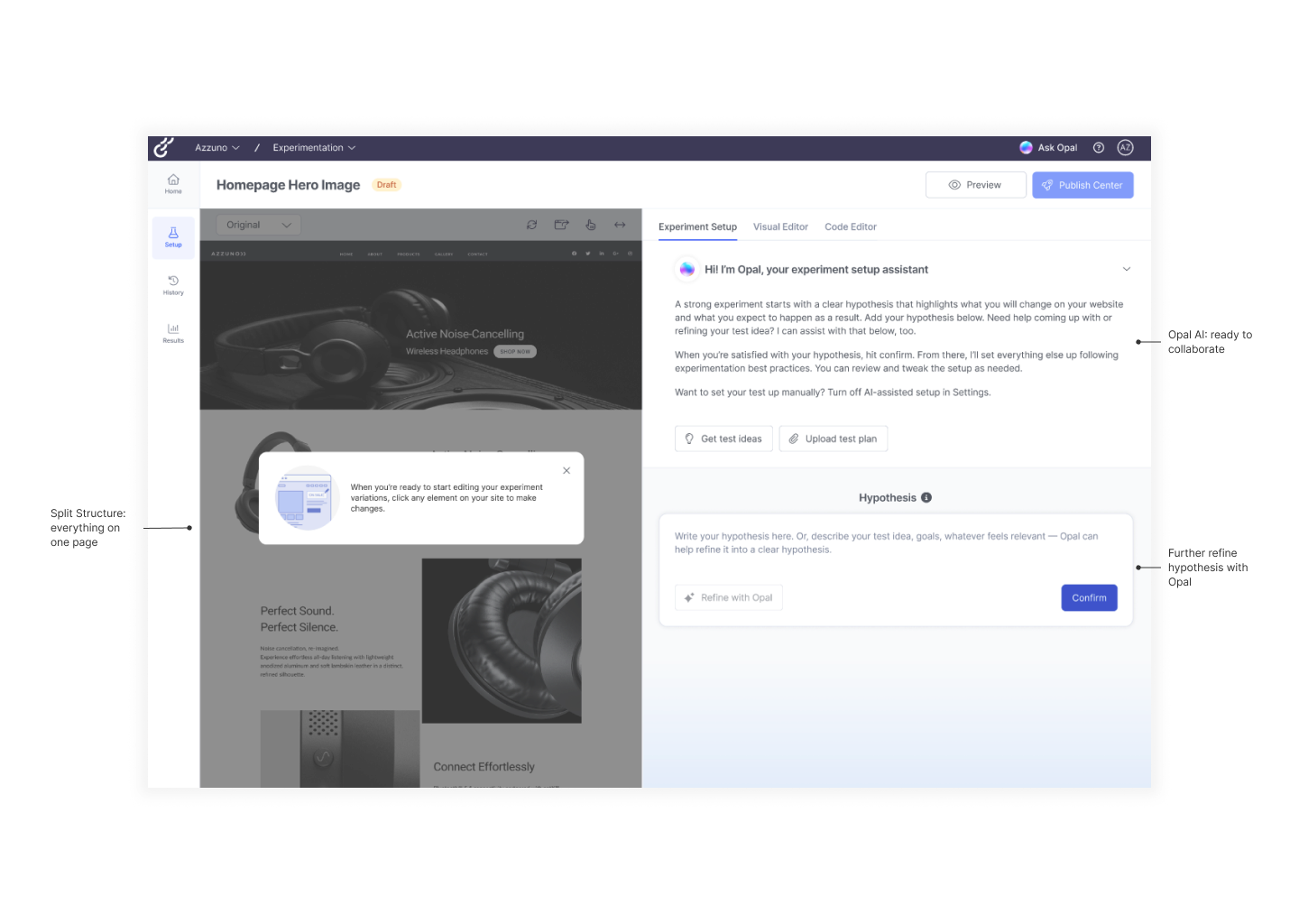
Generating a hypothesis populates the node layout, revealing connections between events and metrics and reinforcing a visual-first workflow.
Opal offers contextual suggestions as users interact with nodes, supporting refinement and informed decisions without distracting from the workflow.
Driving confidence during preview
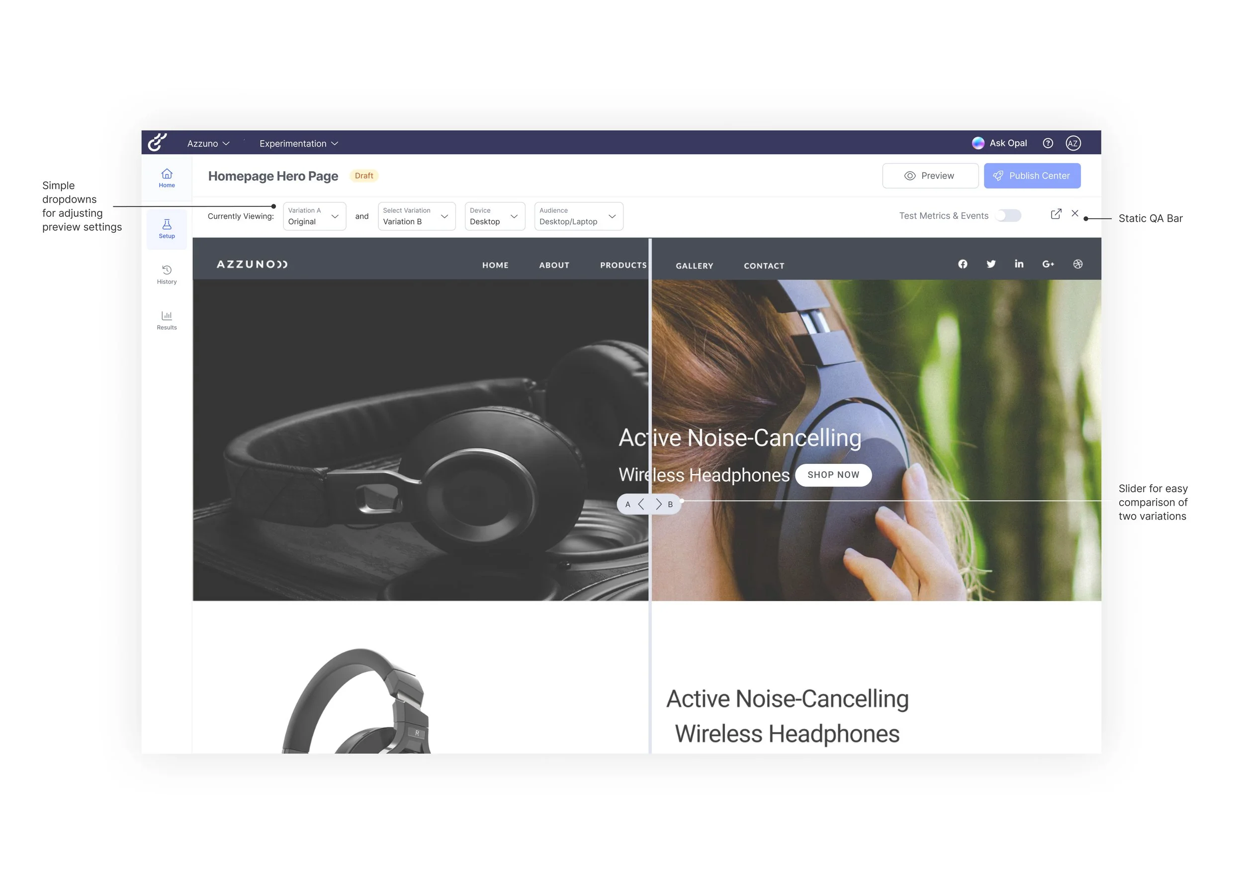
Side-by-side variant comparison improves preview confidence.
A slider overlay allows users to compare variants directly, making differences clear and helping them validate experiments before publishing.
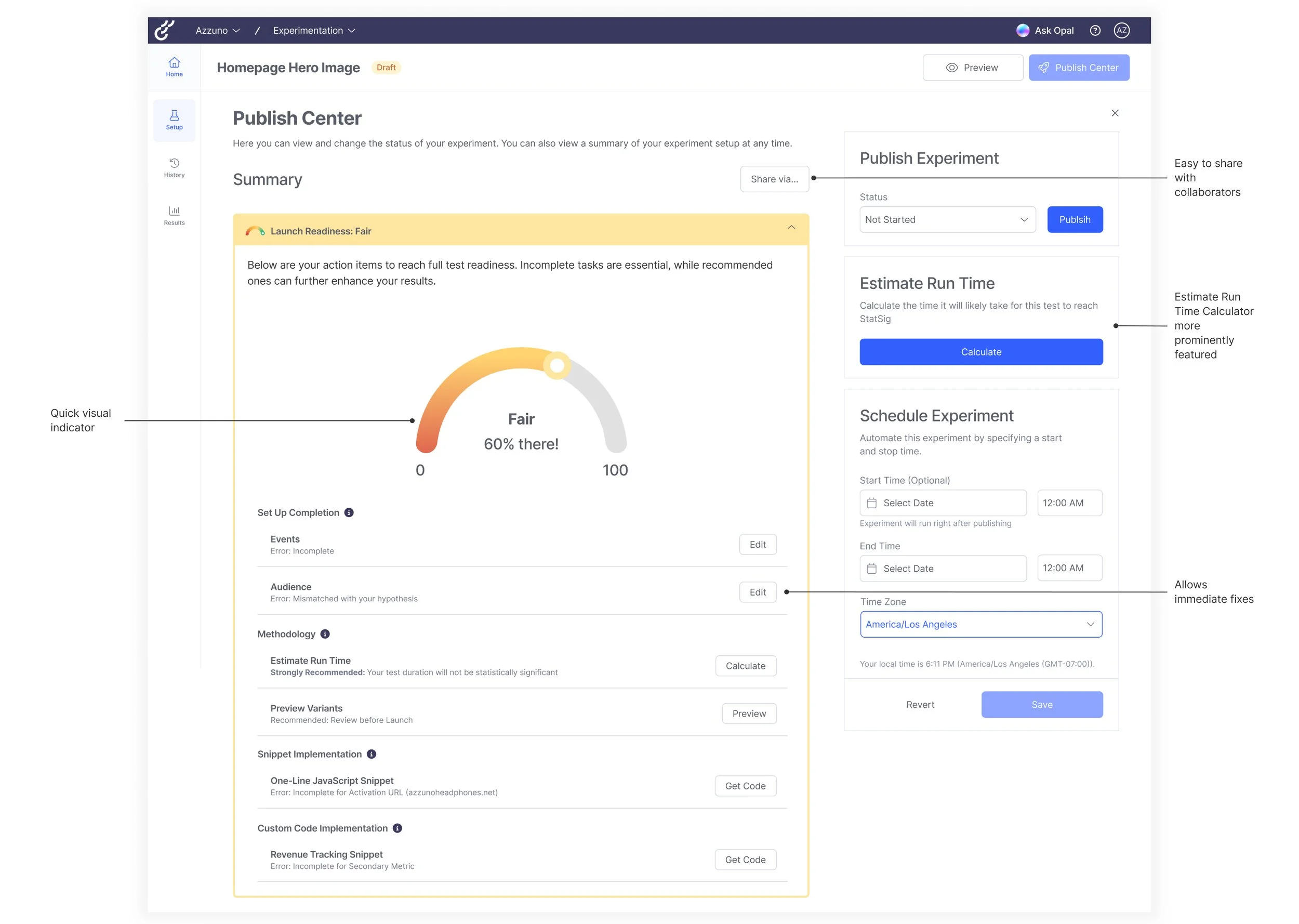
Ensuring statistical significance at launch
A centralized Publishing Center supports reliable launches.
Launch readiness checklists, runtime calculators, and scheduling tools help users finalize, share, and confidently launch experiments.
What our Sponsors are Saying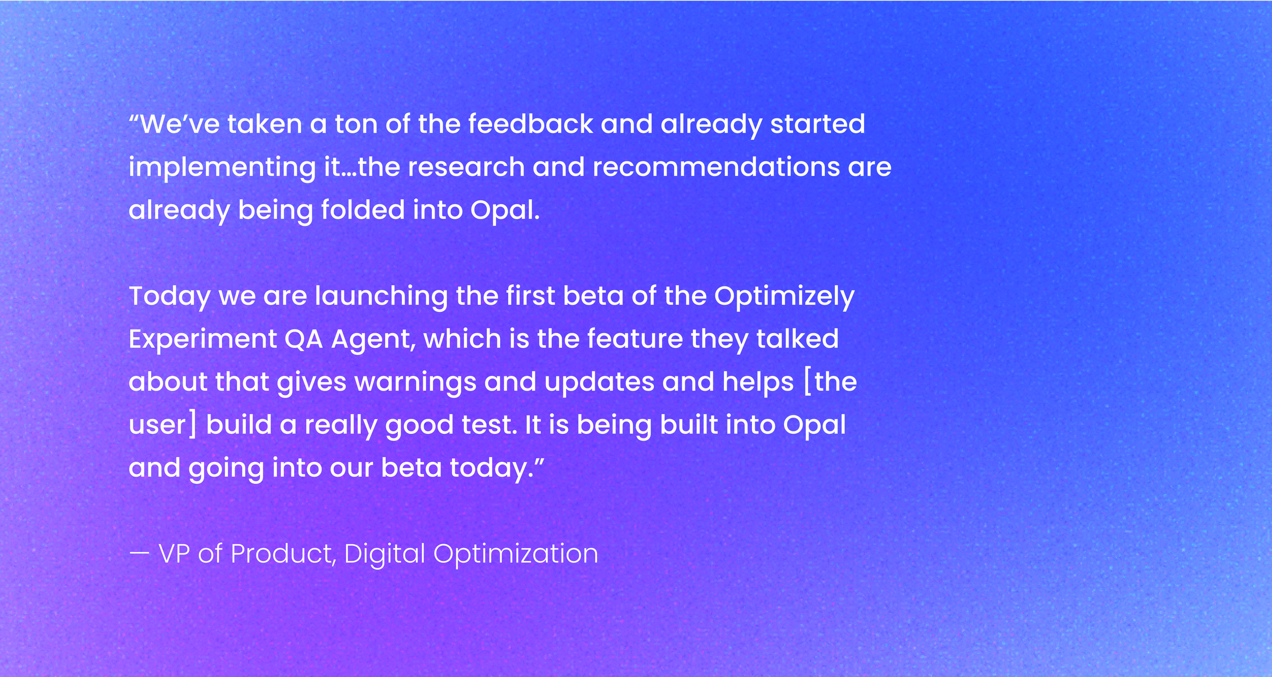
Shaping Optimizely's Web Experimentation roadmap and a Beta launch
ReflectionBalancing design systems
Contextual unfolding
Designing an A/B testing workflow reinforced how important context and progressive guidance are when things get technical. I found journey mapping very helpful in shaping intuitive, step-by-step flows where we could make guidance feel naturally built-in. I also learned that good design offers clear direction with flexible options, a mindset I brought to designing for AI, making support timely and relevant to each user’s situation.
Working with Optimizely’s large design system taught me to start with a small, core set of components for fast, low-fidelity exploration, and selectively stepping outside the system when we needed to push the experience further. That balance between consistency and creative exploration helped the final solution feel both coherent and distinct.